Precision in Execution.

iPad Pro Product Page
Client:Apple Inc.
scope:Localization, Project Management
クライアント: アップル
担当領域: ローカライズ、プロジェクト管理
Client: Apple Inc.
Scope: Localization, Project Management
クライアント: アップル
担当領域: ローカライズ、プロジェクト管理
Executed the localization and graphic asset production for the iPad Pro's Japanese Product Page, aligning global brand aesthetics with visuals tuned for the Japanese market. The team collaborated across design, content, and business-affairs functions to select imagery, craft localized screen layouts, and ensure each asset met brand standards with high polish.
Under challenging time constraints, the team delivered all required high-resolution imagery, screen versions, and asset variants for both desktop and mobile in-market launch contexts. By fostering close coordination with global and local teams, the project achieved seamless visual continuity and clean localization workflows.
---
iPad Proの日本向けプロダクトページのローカライズおよびグラフィックアセットの制作・管理を担当しました。
デザイン、コンテンツ、ビジネス各部門と密に連携し、ビジュアル選定から画面レイアウト、品質管理までを一貫して推進しました。限られたスケジュールの中、デスクトップ・モバイル双方に対応したアセットを仕上げ、完成度の高いローンチを実現しました。
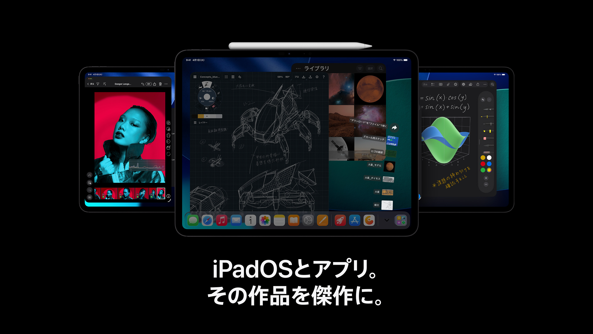
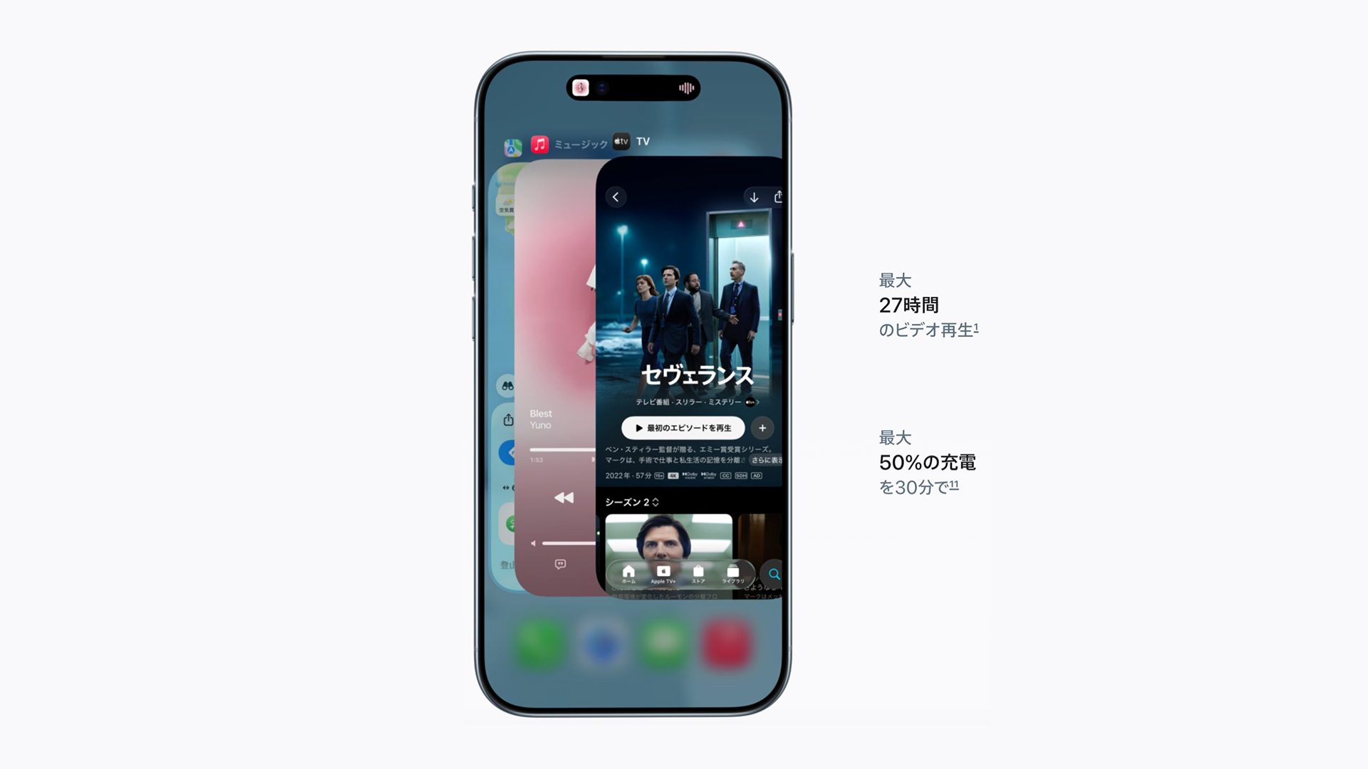
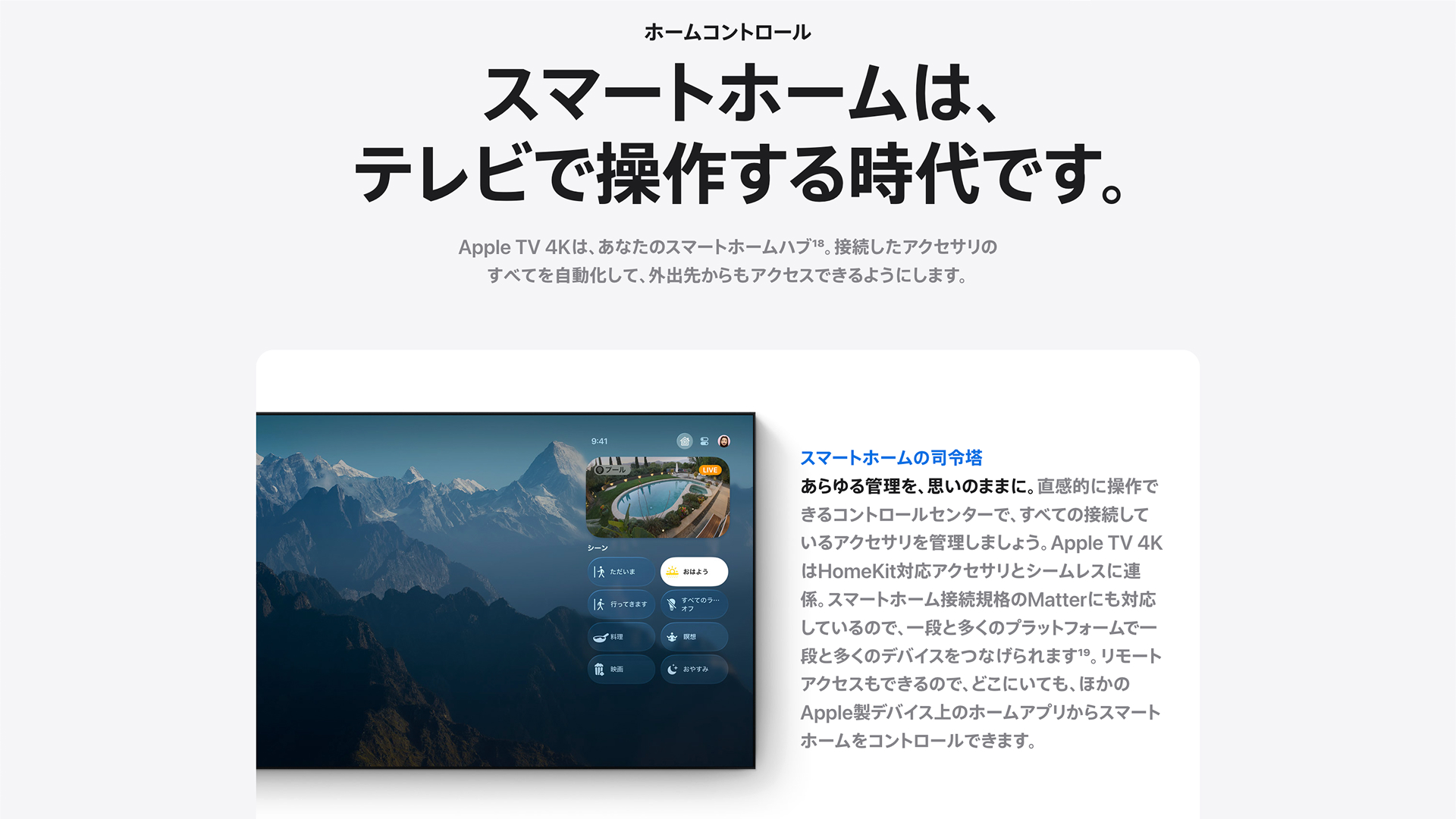
Japanese Product Page for the ipad Pro.
---
iPad Proの日本向けプロダクトページ。
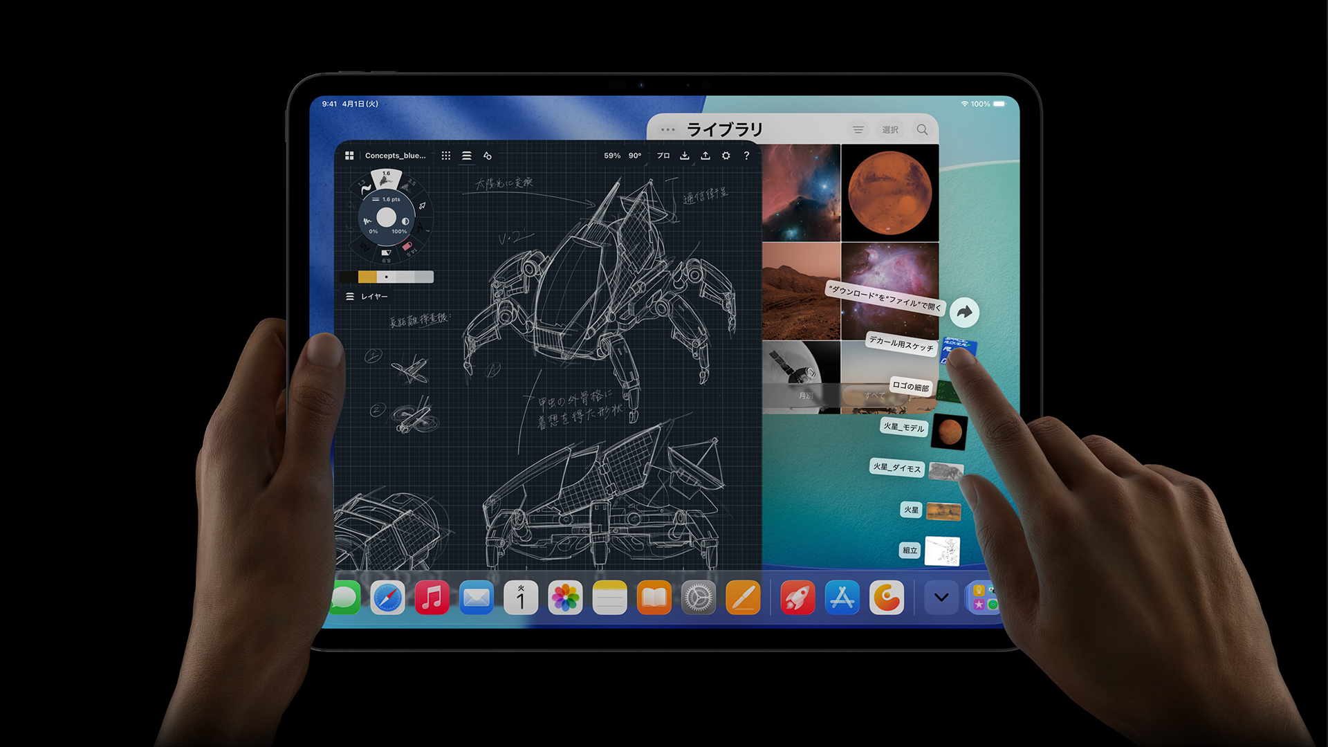
All Device UI and App Screens (First + Third Party) were to be localized for both static and motion assets.
---
デバイスUIおよび各種アプリ画面(純正・サードパーティを含む)をローカライズ。
handwritten elements in the original english version were painstakingly localized by hand. Close supervision was required to ensure the handwriting style aligned with the source material.
---
英語版に含まれていた手書き部分は、一点ずつ手作業で日本語化を行い、原表現に沿った筆跡やニュアンスとなるよう細かく監修。
Attention to detail was key, down to the most minute parts of a screen. even aspects that were likely overlooked were localized.
For example, in the keynote app above, along with the selected slide, each of the slide thumbnails in the sidebar were also revised for localization.
---
画面の見落とされがちな部分も徹底してローカライズ。例として、Keynote画面では選択中スライドだけでなく、サイドバー内のサムネイルすべてを修正。
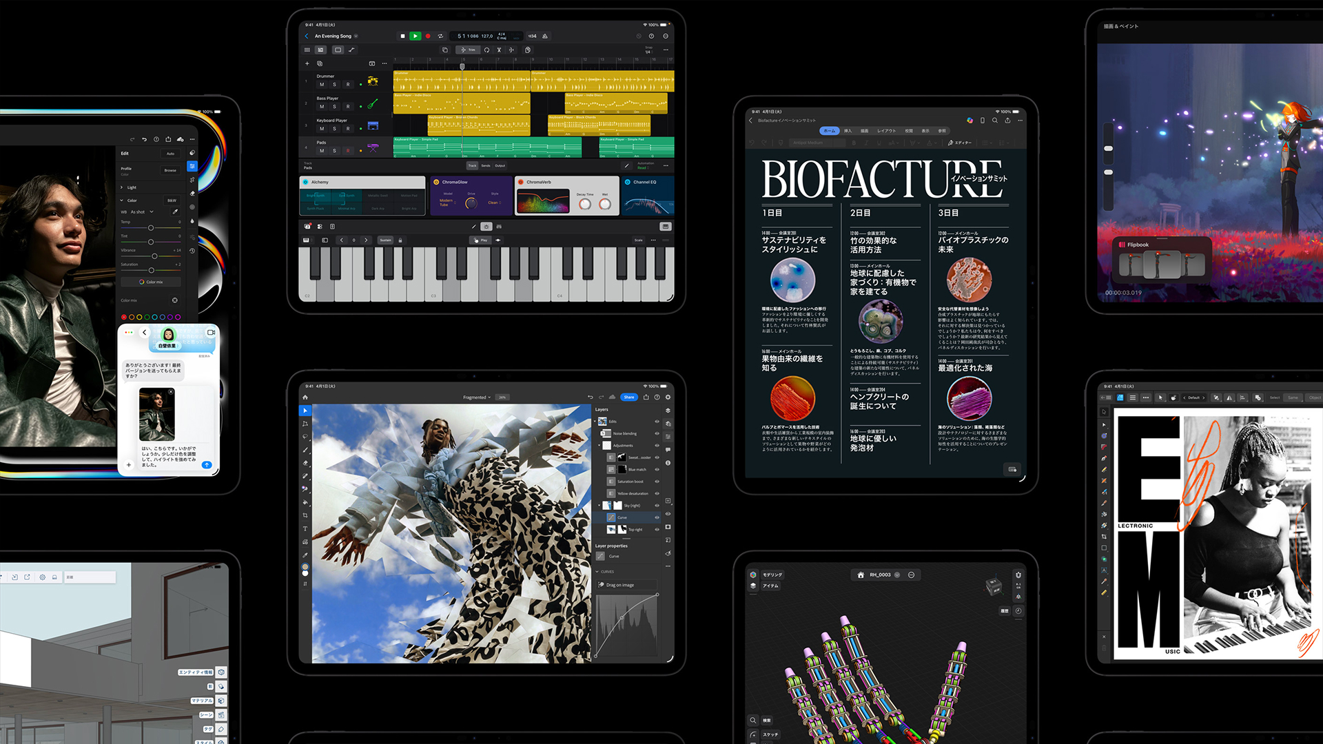
Due to the large number of First and third-party applications, Strict Localization Guidelines for each were established for clarification and consistency, increasing the team's efficiency and accuracy.
---
多数の純正・サードパーティアプリを扱うにあたり、明確なローカライズガイドラインを策定し、作業効率と精度の向上を実現。
iPhone Air Product Page
Client:Apple Inc.
scope:Localization, Project Management
クライアント: アップル
担当領域: ローカライズ、プロジェクト管理
Client: Apple Inc.
Scope: Localization, Project Management
クライアント: アップル
担当領域: ローカライズ、プロジェクト管理
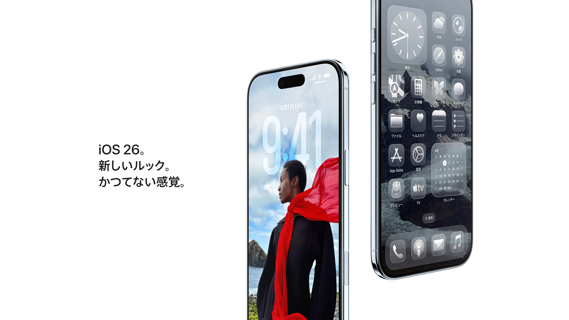
Led the localization of the Japan product page for the iPhone Air, ensuring a seamless integration of Apple’s global design language with culturally resonant content for the Japanese market. The project required precise coordination across cross-functional teams, including content production, design, and business affairs, to align brand tone, layout, and messaging while maintaining Apple’s meticulous visual standards.
Under tight deadlines, the team delivered a full suite of localized graphic assets, including key imagery, UI screen renders, and campaign visuals optimized for both desktop and mobile experiences. Through close collaboration with the global creative team, every design element was refined to achieve both aesthetic and linguistic accuracy, resulting in a cohesive, high-quality launch.
---
iPhone Airの日本向けプロダクトページのローカライズを担当しました。
Appleのグローバルなデザイン言語を基盤に、日本市場に適した表現へと最適化しました。コンテンツ、デザイン、ビジネス部門と密に連携し、トーンやレイアウト、メッセージを調整しました。限られたスケジュールの中、キービジュアルや画面UI、デスクトップ/モバイル向けアセットを高精度で制作しました。
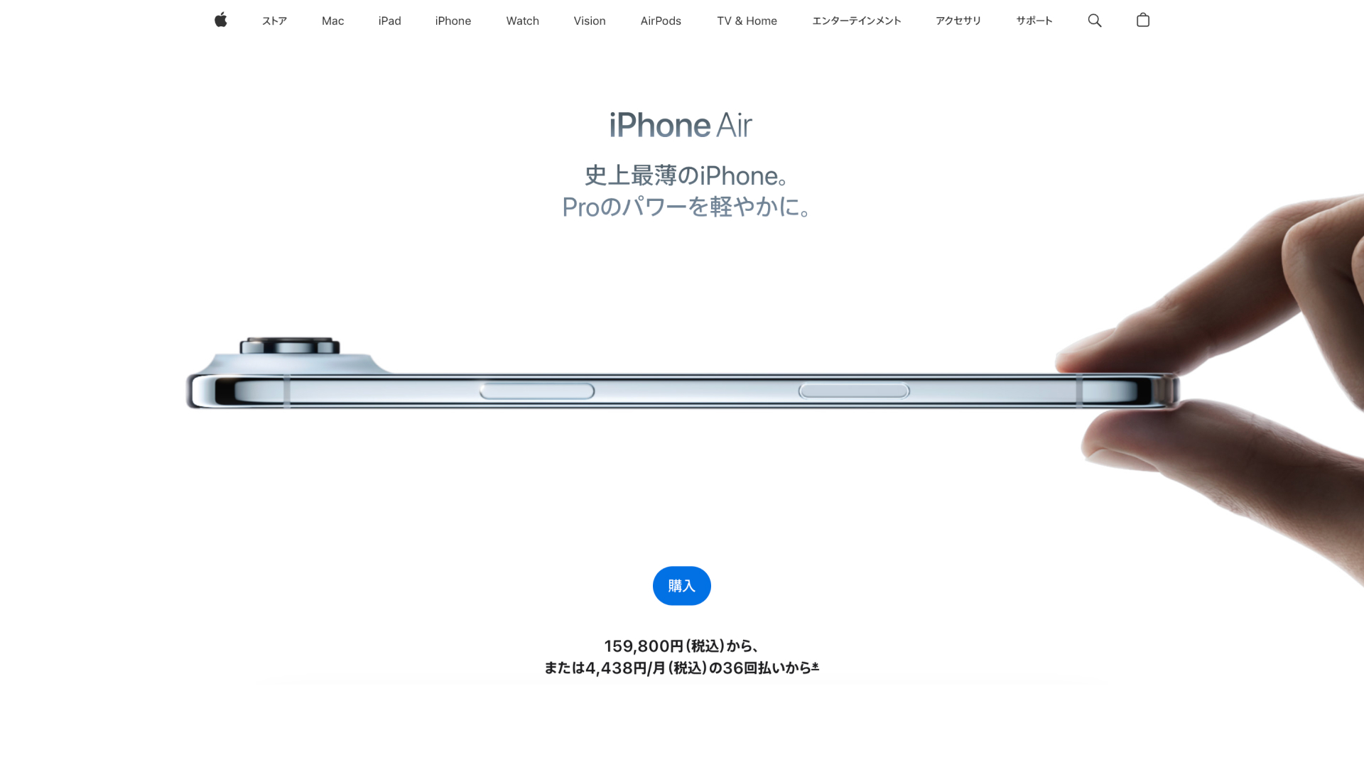
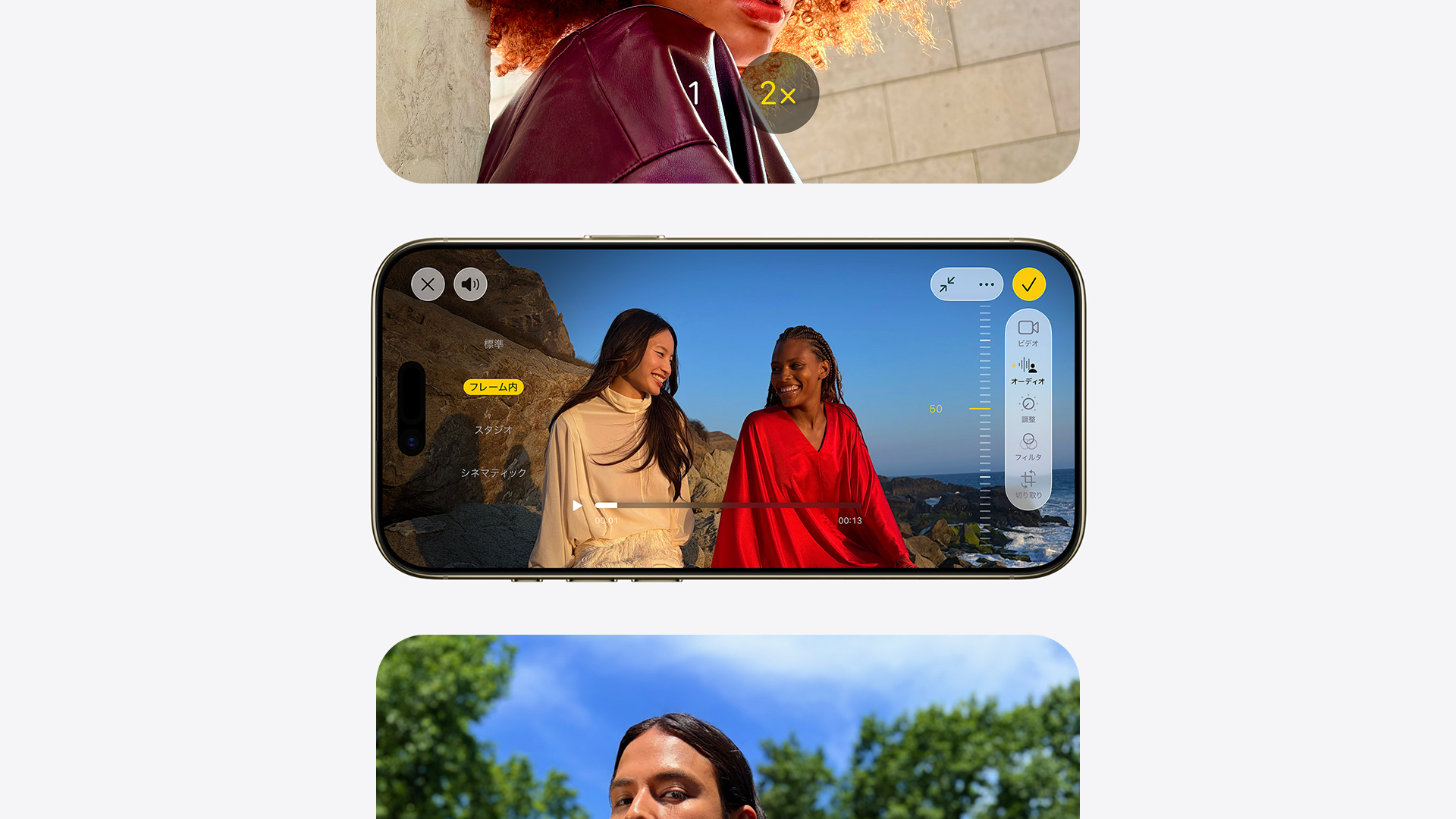
Japanese Product Page for the iPhone Air.
---
iPhone Airの日本向けプロダクトページ。
Localization efforts were focused on the new liquid glass UI.
---
新たに導入されたリキッドガラスUIを中心に、ローカライズ作業を展開。
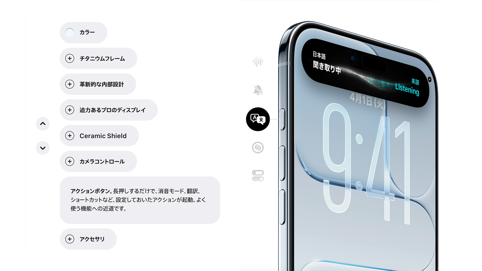
Special attention was given to close-up showcases of key features.
---
主要機能のクローズアップにおいては、細部まで配慮したローカライズを実施。
Complex Animations were also localized in detail, making sure screens were accurately displayed every single frame.
---
複雑なアニメーションについても、全フレームにわたり画面の正確性を担保しながらローカライズ。
Localization also involved selecting assets which best fit the targeted region, meaning careful consideration of cultural aspects such as fashion and tattoos.
---
地域特性に配慮し、ファッションやタトゥーといった文化的要素を踏まえてアセットを選定。
Vision Pro
Client:Apple Inc.
scope:Localization, Project Management
クライアント: アップル
担当領域: ローカライズ、プロジェクト管理
Client: Apple Inc.
Scope: Localization, Project Management
クライアント: アップル
担当領域: ローカライズ、プロジェクト管理
For the Japanese localization of Apple’s Vision Pro product page, I was responsible for ensuring the accuracy and consistency of all graphic assets and visual content. The focus was on seamlessly translating Apple’s global design language into a Japanese context while preserving the precision, clarity, and premium quality expected of the brand.
Working closely with cross-functional teams, I oversaw the localization of key imagery and UI screen renders, ensuring they were both linguistically correct and cohesive. Attention to detail was critical, with every asset reviewed to meet Apple’s exacting standards.
The result was a polished and culturally resonant product page that supported a high-profile launch in the Japanese market. Through close collaboration with the global creative team, the project delivered a unified, high-quality presentation that balanced global consistency with local relevance, reinforcing the strength and clarity of the Vision Pro experience.
---
Vision Proの日本向けプロダクトページのローカライズを担当。
Appleのグローバルなデザイン言語を基盤に、日本市場における文化的文脈を踏まえつつ、精度・明瞭性を損なうことなく最適化を実施。各部門と密に連携し、キービジュアルや画面UIを細部まで精査。
結果、グローバルとローカルの両立を実現したプロダクトページを完成させた。
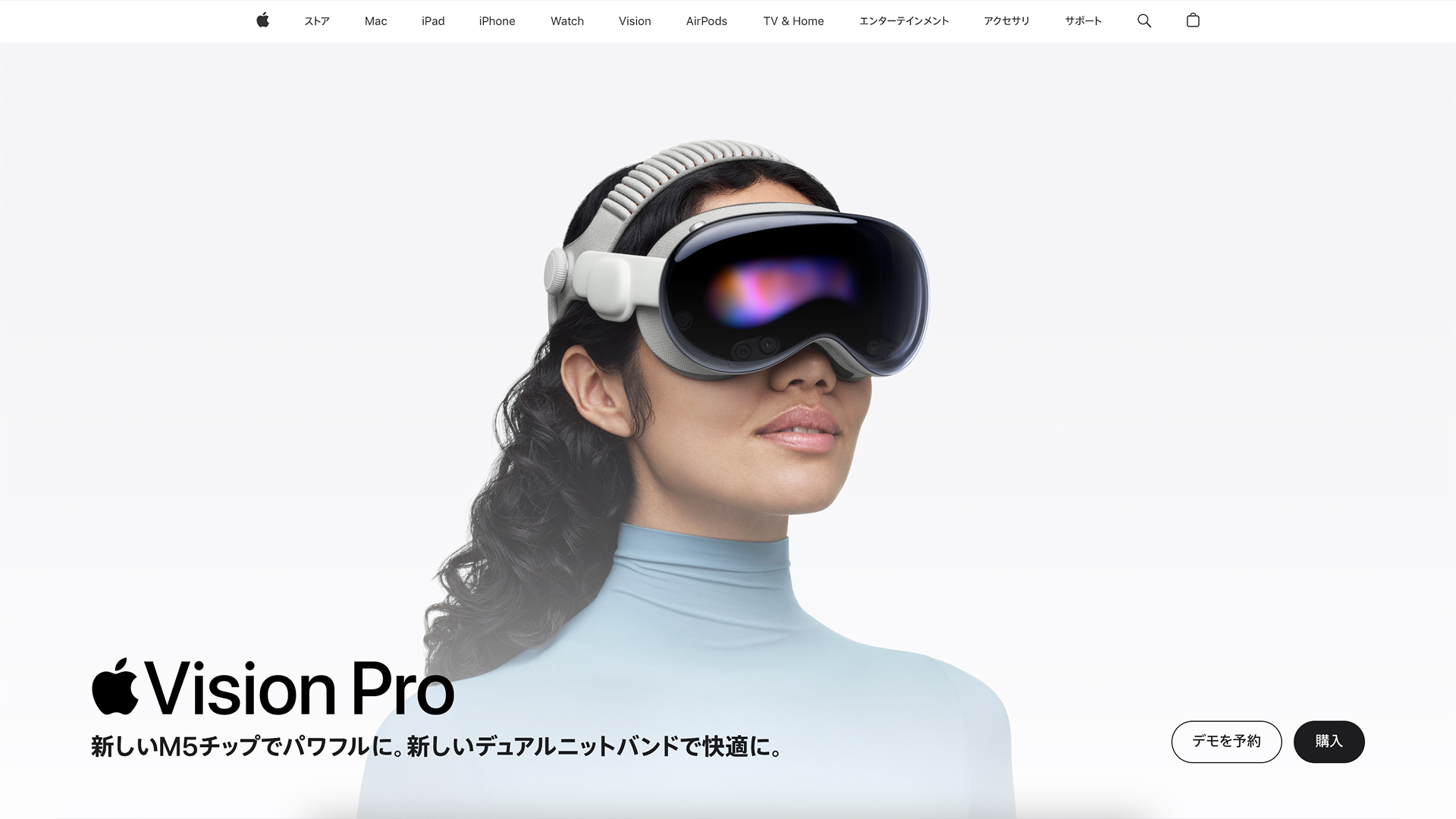
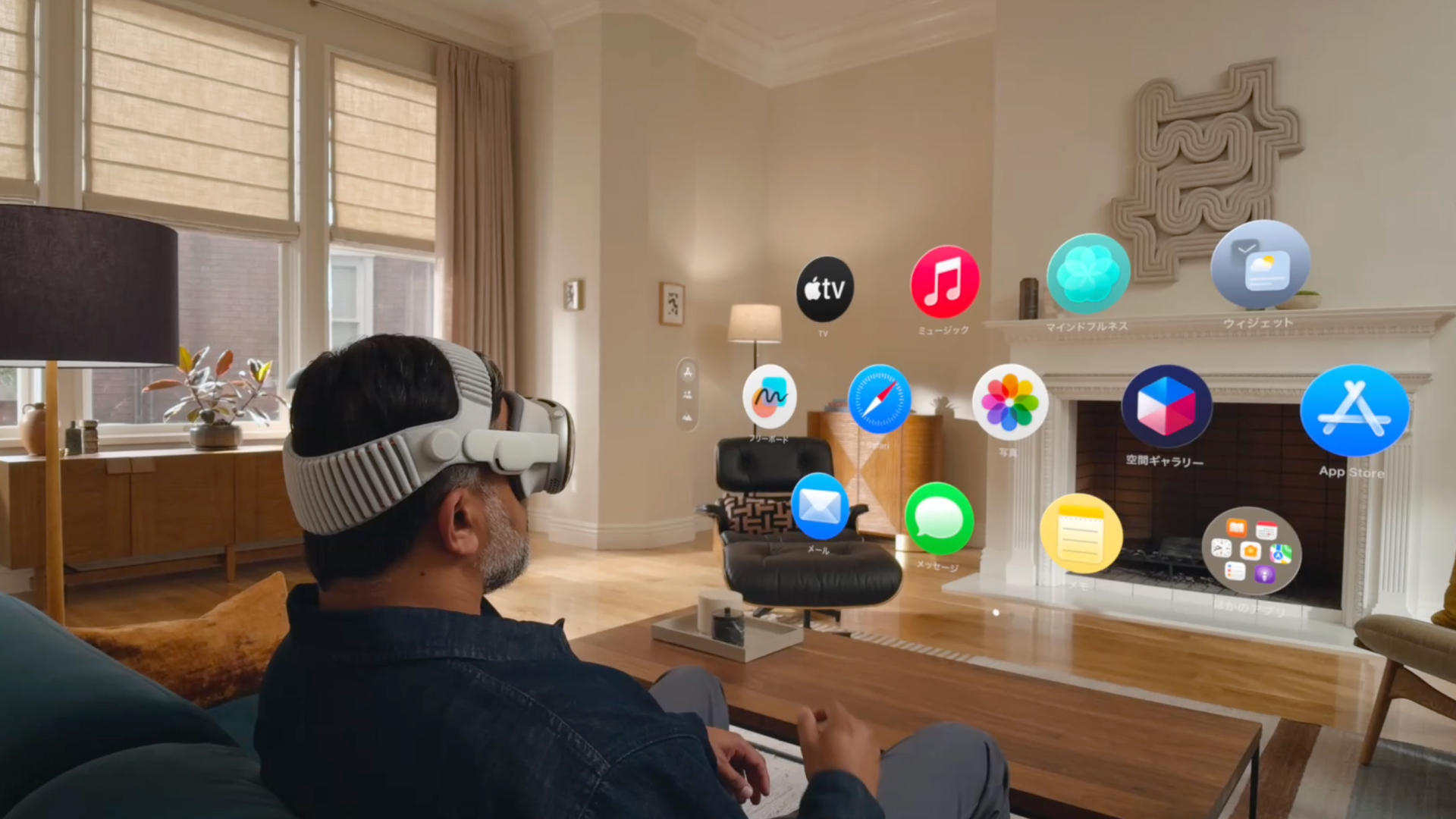
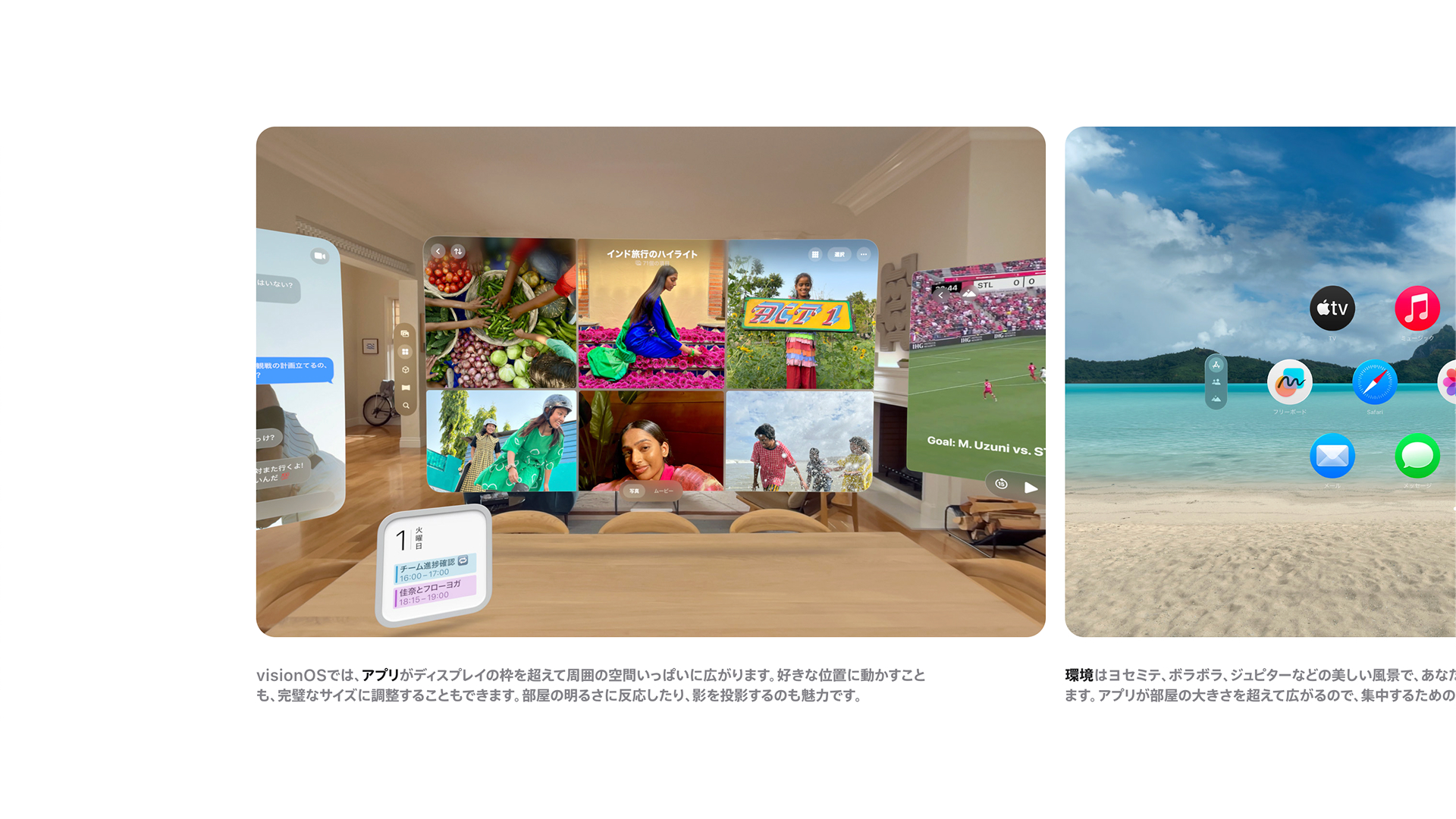
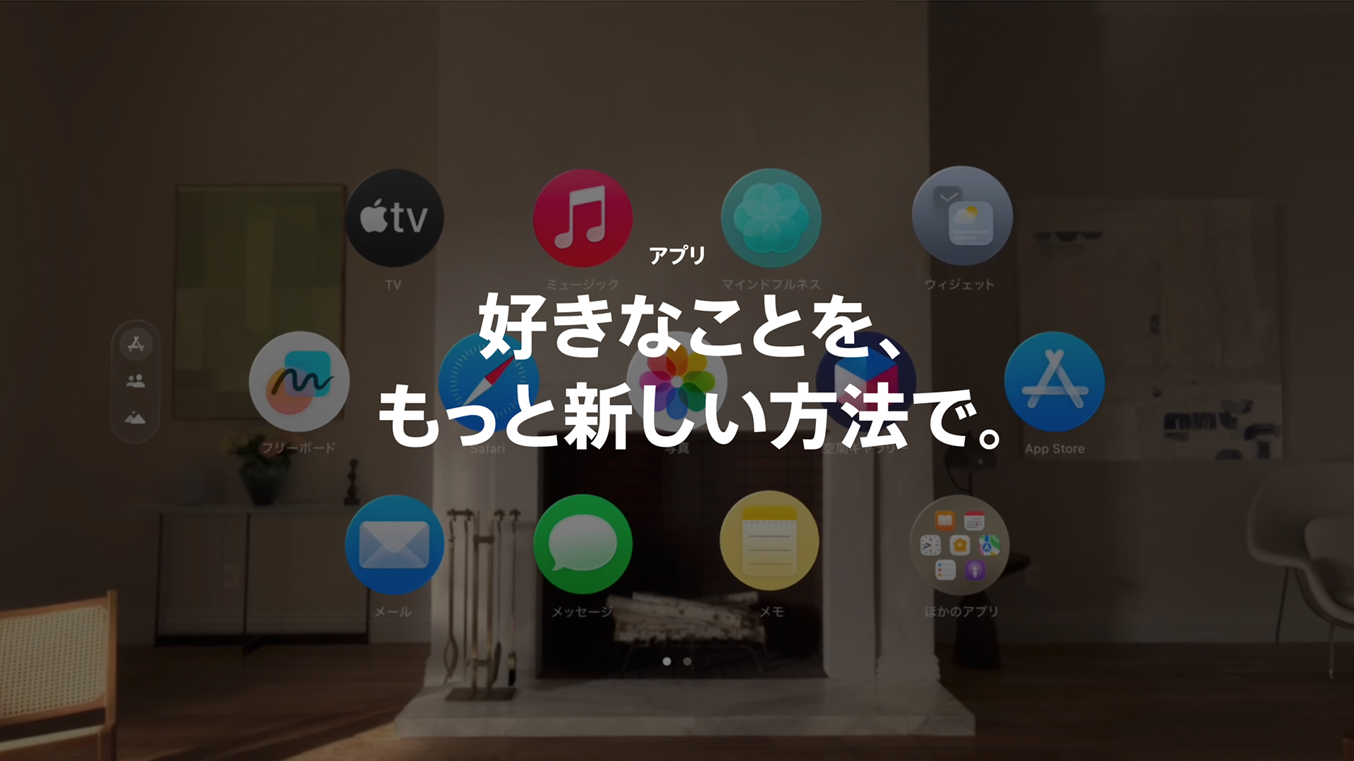
Japanese Product Page for the Vision Pro.
---
Vision Proの日本向けプロダクトページ。
All static and dynamic content were localized precisely.
---
静的・動的コンテンツを正確かつ丁寧にローカライズ。
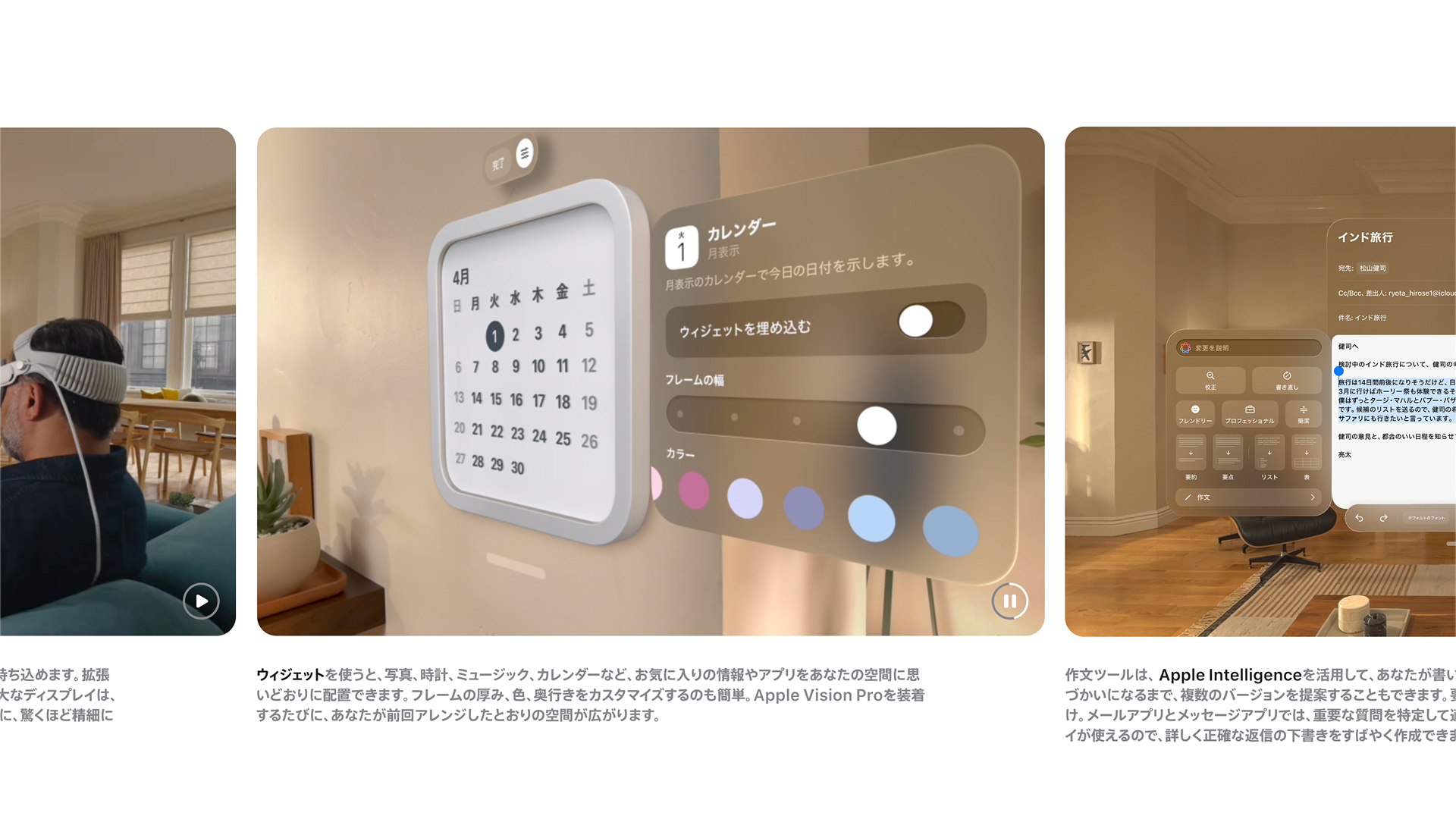
Attention to detail was critical, every asset reviewed for accuracy.
---
細部への配慮を徹底し、すべてのアセットを精査して品質を管理。
3D Renders were carefully localized, closely coordinating with overseas production teams.
---
3D素材については、海外制作チームと密に連携しながらローカライズを実施。
Several graphics depicted multiple complex screens which proved challenging to localize under tight deadlines.
---
複数の画面を含む複雑なグラフィックも、限られたスケジュールの中で対応。
The localized product page helps convey the vision pro experience to Japanese users through tailored content and messaging.
---
最終的に、日本のユーザーに向けてVision Proの体験価値を的確に伝えるプロダクトページを実現。
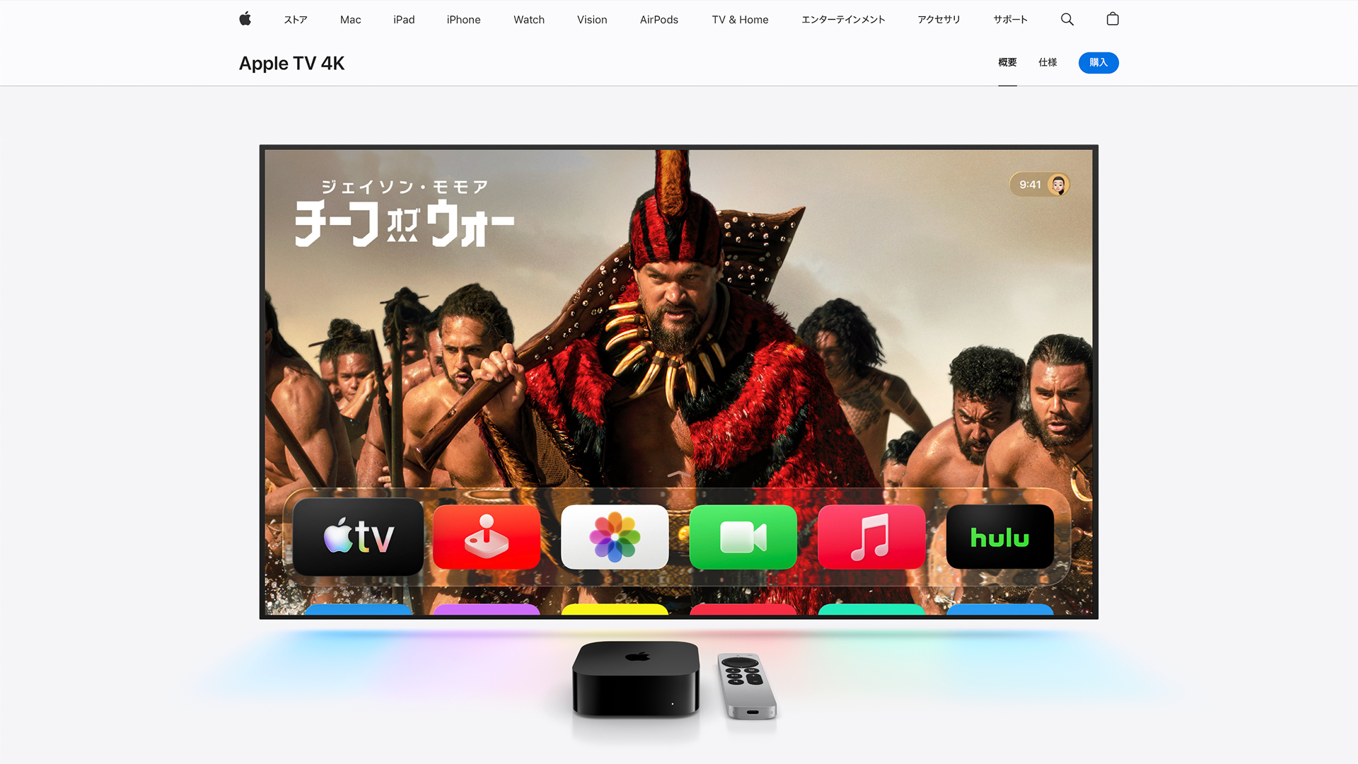
Apple TV 4k
Client:Apple Inc.
scope:Localization, Project Management
クライアント: アップル
担当領域: ローカライズ、プロジェクト管理
Client: Apple Inc.
Scope: Localization, Project Management
クライアント: アップル
担当領域: ローカライズ、プロジェクト管理
The Japanese localization of Apple’s Apple TV 4K product page required all graphic assets and on-page content to be culturally and linguistically precise, as well as aligned with Apple’s global standards. As one of the leaders of the Japanese content team, I was responsible for overseeing the accuracy and consistency of localized visuals, working closely with cross-functional teams across content production, design, and business affairs.
Overseeing a team of 8, the other team leaders and I coordinated the adaptation of key imagery and UI screen renders under tight timelines. Particular care was taken to preserve Apple’s exacting aesthetic and tone while optimizing assets for both desktop and mobile experiences. Each element was reviewed and refined to ensure clarity, tonal alignment, and seamless integration within the broader product ecosystem.
The result was a polished, market-specific product page that upheld Apple’s meticulous brand standards while resonating locally. The successful delivery supported a cohesive launch presentation in Japan, demonstrating how thoughtful localization can enhance both usability and brand perception without compromising global consistency.
---
Apple TV 4Kの日本向けプロダクトページのローカライズにおいて、日本市場における文化的・言語的正確性と、Appleのグローバル基準との整合性を両立させることを目的に、ビジュアル表現全体を統括。
日本コンテンツチームのリードの一人として、ビジネス部門と連携しながら、各種グラフィックアセットの品質と一貫性を管理した。
8名規模のチームを率い、キービジュアルや画面UIの修正を短期間で遂行。
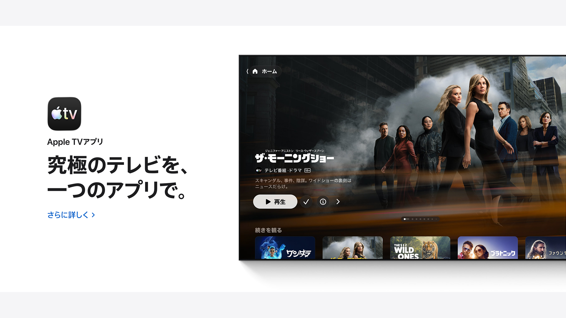
Japanese Product Page for the Apple TV 4k.
---
Apple TV 4Kの日本向けプロダクトページ。
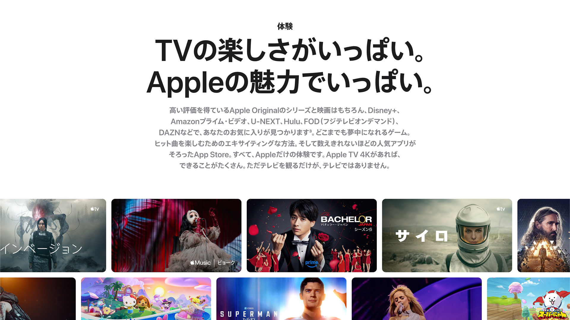
All shows were localized to those available and/or appealing to Japanese audiences.
---
掲載コンテンツは、日本のユーザーにとって関心度の高い作品に厳選してローカライズ。
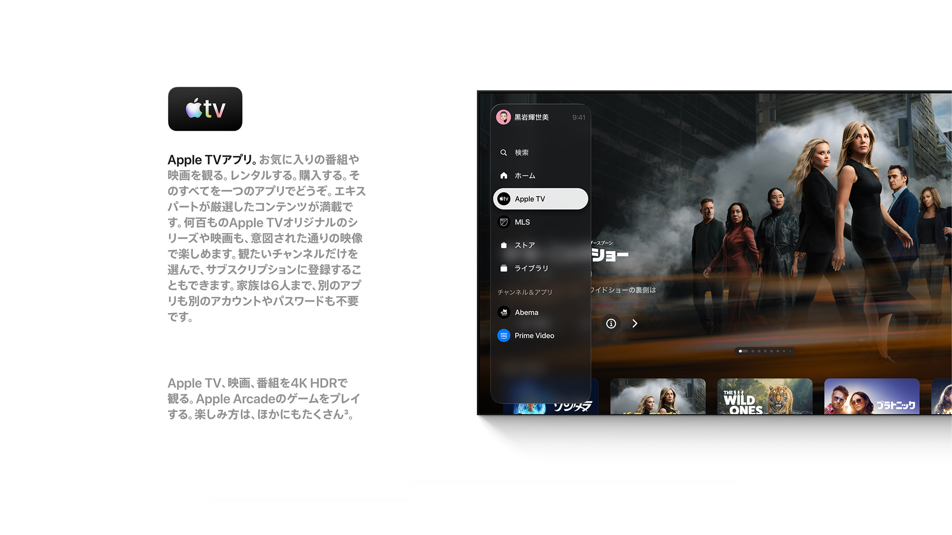
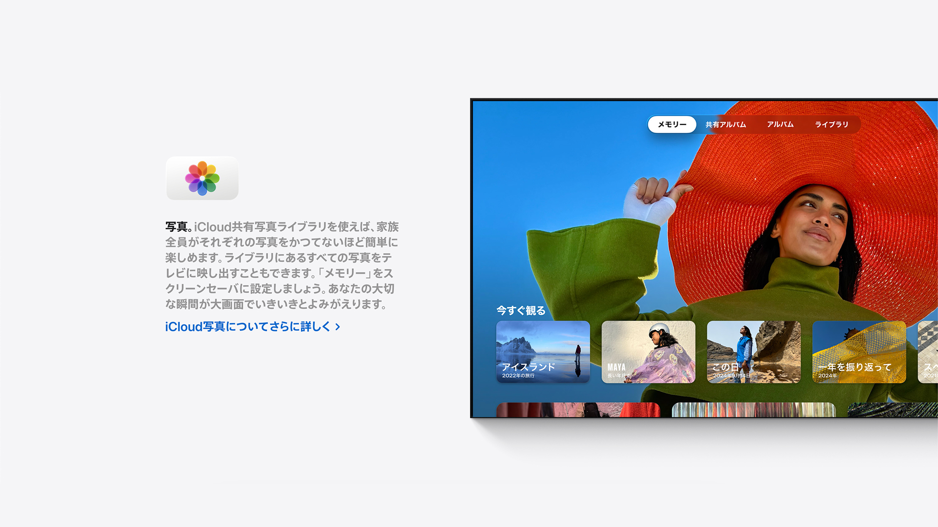
Screens were carefully edited to accurately reflect Japanese UI, Icons, and third-party content, including title treatment.
---
日本語UIやアイコン、サードパーティコンテンツのタイトル表記に至るまで、画面キャプチャを精緻に調整。
Japanese localization requires particular attention to type treatment, ensuring adherence to Apple guidelines for consistency.
---
日本語ローカライズにおいては、Appleのガイドラインに沿ったタイポグラフィを徹底し、全体の一貫性を担保。
Variable UI found in certain screens were localized with close coordination with translation and copywriting teams.
---
一部画面に見られる可変的なUI要素については、翻訳・コピーライティングチームと密に連携しながら対応。
Despite tight deadlines, our team was able to deliver high volumes of localized assets with polish and accuracy.
---
タイトなスケジュールの中でも、高い精度と完成度を保った大量のローカライズアセットを仕上げた。
Random_03
Personal Work
自主制作
Personal Work
自主制作
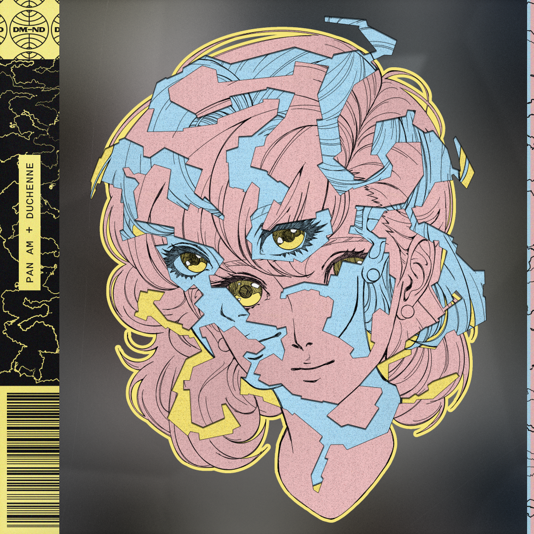
Pan Am + Duchenne

Sisters

The Blueprint

1:43AM

Random_o2
Personal Work
自主制作
Personal Work
自主制作
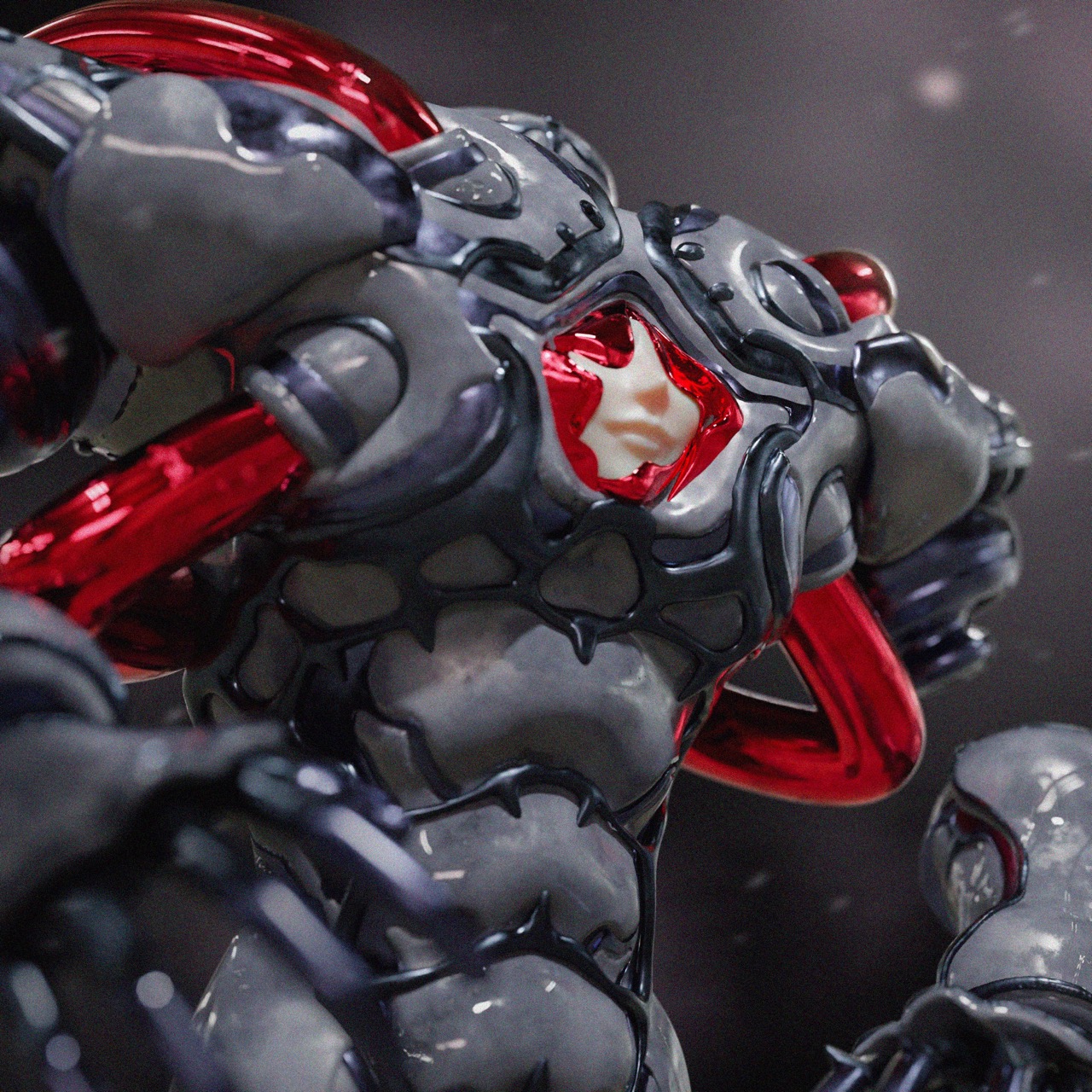
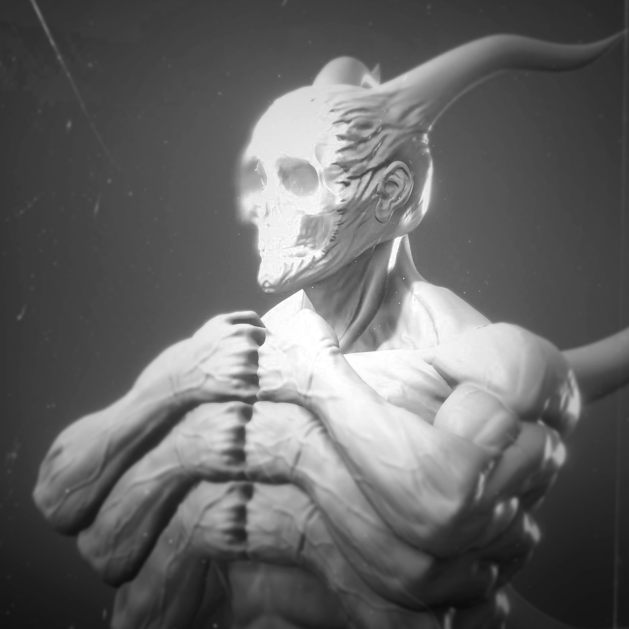
The overseer
Gigant

Game Poster (Fictional)
---
架空ゲームポスター

Puppet Queen

Azuma Shoukai
Client:Azuma SHoukai
scope:Web Design
クライアント: 吾妻商会
担当領域: Webデザイン
Client: Azuma Shoukai
Scope: Web Design
クライアント: 吾妻商会
担当領域: Webデザイン
Azuma Shoukai is a diversified industrial supplier and manufacturer. I led the renewed web design with a focus on establishing a cohesive design system that could clearly organize a large volume of information while improving overall usability and navigation across the homepage’s many sections.
The redesign introduced a clean, professional visual language built around generous white space, a restrained color palette, and blue accents to reinforce trust and reliability. A considered, minimal layout was used to surface complex content in a structured and digestible way, allowing users to quickly understand Azuma Shoukai’s offerings without visual overload. Every design decision balanced clarity, hierarchy, and accessibility, ensuring the site felt both modern and approachable.
The result is a homepage that successfully aligns visual refinement with functional performance, strengthening brand perception while making the company’s services easier to explore. The renewed design system provides a scalable foundation for future content, effectively communicating Azuma Shoukai’s expertise and core values through a user-centered, contemporary web experience.
---
吾妻商会のコーポレートサイトリニューアルのWebデザインを担当。情報量の多い構成を整理し、直感的な導線を実現するため、全体を貫くデザインシステムを構築。
余白を活かしたクリーンなレイアウトと抑制の効いたカラーパレット、信頼感を強調するブルーを基調に、専門性と親しみやすさを両立。
結果として、視覚的洗練と機能性を兼ね備えたホームページを実現し、ブランド価値の向上と今後の拡張性を支える基盤を確立。

Azuma SHoukaI is a long-running business built on quality and reliability, and the revamp project aimed to reflect such core values in a more modern and user-friendly space.
---
品質や信頼性を含む、吾妻商会のコアバリューを現代的でユーザーフレンドリーなデジタル空間として表現することを目的にリニューアルを実施。
Minimal and refined design solutions provide structure, clarity, and accessibility.
---
ミニマルかつ洗練されたデザインアプローチにより、情報の構造化と高い可読性、アクセシビリティを確保。

A responsive system was designed for desktop and mobile platforms.
---
レスポンシブなデザインシステムを構築。

Azuma Shoukai's vast network of pages and data underwent Several rounds of prototyping and feedback for its renewal, with an emphasis on intuitiveness and balance.
---
膨大なページ数と情報量を持つサイト構成に対し、直感性とバランスを重視したプロトタイピングとフィードバックを重ねながらリニューアルを実施。

Mobile layouts were also structured to allow the website's complex content to be easily accessed and digested.
---
モバイルレイアウトにおいても、複雑なコンテンツを無理なく理解できる情報設計を実現。
Google Pixel 6 Camera Demo
Client:GOogle Japan
scope:UI/UX Design, Image/Video Editing
クライアント: グーグルジャパン
担当領域: UI/UXデザイン、画像・動画制作
Client: Google Japan
Scope: UI/UX Design, Image/Video Editing
クライアント: グーグルジャパン
担当領域: UI/UXデザイン、画像・動画制作
The Google Pixel 6 Camera Demo was an interactive online and in-store experience designed to showcase the device’s core camera innovations ahead of launch. The demo highlighted key features including AI-powered Portrait mode, image recognition, and Magic Eraser, translating complex computational photography capabilities into an intuitive, hands-on product narrative for consumers.
Working closely with technical directors, I led the design of an interface that closely emulated the Pixel 6 camera UI. Interactive components—such as the shutter button and navigation elements—were carefully designed to function as triggers for embedded screen recordings, seamlessly blending real UI interactions with pre-recorded feature demonstrations. This approach ensured both visual authenticity and technical reliability across platforms.
The demo was deployed across in-store display devices and official Pixel 6 product pages for a limited release period, serving as a key touchpoint in the product’s launch phase. The project successfully bridged physical retail and digital environments, enabling users to experience the Pixel 6’s camera capabilities in a controlled, polished, and highly accessible format prior to release.
---
Google Pixel 6の発売に先駆け、オンラインおよび店頭向けに展開されたインタラクティブカメラデモのデザインを担当。AIポートレート、画像認識、マジック消しゴムといった先進的なカメラ機能を、直感的に理解できるデモとして構築。
テクニカルディレクターと密に連携し、Pixel 6のカメラUIを忠実に再現したインターフェースを設計。本デモは期間限定で店頭ディスプレイおよび公式プロダクトページに導入され、実機体験に近い形で製品価値を伝える重要なローンチ施策として機能した。
The demo showcased (From Left) the Magic Eraser, Portrait Mode, and Image Recognition features.
---
デモでは、(左から)マジック消しゴム、ポートレートモード、画像認識機能を紹介。
A custom menu was built for the camera demo. The simple layout effectively guided users through all demo features.
---
カメラデモ専用のカスタムメニューを設計し、シンプルな構成によって各機能を直感的に体験できる導線を実現。
In addition to in-store display devices, the demo was also accessible online via qr code.
---
店頭ディスプレイ端末に加え、QRコード経由でオンラインからもアクセス可能なデモとして展開。
EMO+ for HPE
Client:Hewlett Packard Enterprise Japan
scope: Concept Design, Graphic Design, UI/UX Design, Storyboarding, Video Direction, Image/Video Editing
クライアント: 日本ヒューレット・パッカード合同会社
担当領域: コンセプトデザイン、グラフィックデザイン、UI/UXデザイン、絵コンテ、映像ディレクション、画像・動画編集
Client: Hewlett Packard Enterprise (HPE) Japan
Scope: Concept Design, Graphic Design, UI/UX Design, Storyboarding, Video Direction, Image/Video Editing
クライアント: 日本ヒューレット・パッカード合同会社
担当領域: コンセプトデザイン、グラフィックデザイン、UI/UXデザイン、絵コンテ、映像ディレクション、画像・動画編集
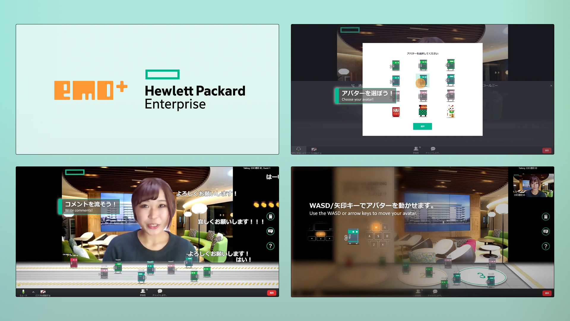
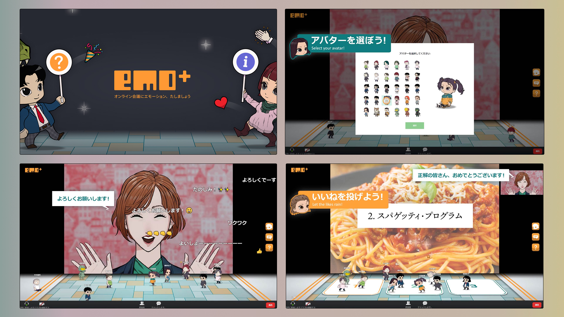
EMO+ for HPE is a custom-built Zoom extension developed specifically for HPE, based on the original in-house EMO+ platform. Created in response to the rapid shift to remote work during the COVID-19 pandemic, it supports employee onboarding while strengthening communication across teams. The system enhances virtual meetings through controllable avatars, real-time reactions, customizable themes, and anonymous commenting—adding a more human, expressive layer to digital collaboration.
I led the project end-to-end, overseeing concept design, graphic design, UI/UX design, storyboarding, video direction, and image/video editing. My role involved adapting the original EMO+ framework to HPE’s organizational needs and translating its culture into a cohesive digital experience. I designed intuitive user flows and interaction systems, developed the visual identity, and ensured usability across all touchpoints.
In addition, I directed and produced onboarding tutorial videos and refined the interface through iterative prototyping and stakeholder alignment. By balancing playfulness with clarity and corporate context, I delivered a tailored internal tool that streamlined onboarding and fostered more open, dynamic communication within HPE’s remote environment.
---
EMO+ for HPEは、自社プロダクトであるEMO+をベースに、HPE向けにカスタマイズ開発されたZoom拡張ツールです。コロナ禍におけるリモートワーク移行を背景に、新入社員のオンボーディング支援と社内コミュニケーション活性化を目的として設計されました。操作可能なアバター、リアクション機能、カスタムテーマ、匿名コメント機能を通じて、オンライン会議により人間味と双方向性を加えています。
本プロジェクトでは、コンセプト設計からアウトプットまで一貫して担当。コンセプトデザイン、グラフィック制作、UI/UX設計、ストーリーボード作成、映像ディレクション、画像・動画編集まで幅広く担い、既存EMO+の仕組みをHPEの組織文化や目的に合わせて再設計しました。直感的なユーザーフローと統一感のあるビジュアル体験を構築しています。
さらに、初回利用者向けの操作説明動画の企画・演出・編集も担当し、プロトタイピングと関係者調整を重ねながら体験を最適化しました。企業環境に適した明快さと遊び心のバランスを保ちつつ、オンボーディングを円滑化し、リモート環境下でも活発なコミュニケーションを促す社内ツールとして完成させました。
EMO+ for HPE adds a layer of interactivity to virtual meetings with controllable avatars, custom themes, and an anonymous commenting system.
---
Emo+ for HPEは操作可能なアバター、カスタムテーマ、匿名コメント機能を通じて、バーチャルミーティングに新たなインタラクティブ体験を提供する拡張機能です。

Custom seasonal and festive themes.
---
季節やイベントに合わせたカスタムテーマ。

Stylesheets and storyboards for the filming and production of the onboarding tutorial video.
---
オンボーディング用チュートリアル動画の撮影・制作における、スタイルシートおよびストーリーボード。
JSTCD
Client:JSTCD
scope:Web Design
クライアント: 皮膚臨床技術研究会
担当領域: Webデザイン
Client: JSTCD
Scope: Web Design
クライアント: 皮膚臨床技術研究会
担当領域: WEBデザイン
The existing JSTCD (Japan Society of Technique for Clinical Dermatology) website contained a large volume of academic content with a complex structure, making navigation and content discovery difficult. Key pages — especially the clinical reports listing — lacked clarity and refinement, resulting in inefficient user journeys.
I Led the visual and layout redesign of the homepage and the clinical reports listing page. navigation and layout systems were redesigned, and a minimal, academic visual direction with improved typography, spacing, and hierarchy was applied. Clear layouts and categories enhanced readability and content discoverability.
AS A RESULT, THE Improved content LAYOUT AND INTUITIVE IMPLEMENTATIONS Received positive client feedback for balancing usability with a refined, research-oriented visual identity.
---
皮膚臨床技術研究会のトップページおよび「協力者からの改善報告」一覧ページのデザインリニューアルを担当。既存サイトは情報量が多く、コンテンツ構造が複雑で、目的ページへの到達に複数ステップを要するなど、ユーザー導線と視認性に課題があった。特に「臨床協力者からの報告一覧」ページは更新頻度が高い一方で、一覧性と可読性が十分に確保されていなかった。
情報設計の整理から着手し、ナビゲーション構造とレイアウトを再設計。視線誘導を意識したUI構成、余白設計、タイポグラフィの最適化により、アカデミック領域に適した信頼感と可読性を両立したビジュアルトーンを構築。
主要コンテンツへのアクセス性、そして更新情報の一覧性と検索性が向上し、運営側からも「情報が探しやすくなった」と評価を獲得。

CLARITY, INTUITIVENESS, AND ORGANIZATION WERE SOME OF THE KEY IMPROVEMENT POINTS FOR THE JSTCD WEBSITE REDESIGN.
---
当サイトのリニューアルは、主に明快さ・直感性・情報整理を改善ポイントとして設計しました。

THE REVISED RESPONSIVE DESIGN SYSTEM PRESENTED the site's expansive information archive in an easily legible and accessible manner.
---
改訂したレスポンシブデザインにより、膨大な情報量を可読性とアクセス性の高い形で提示しました。

The site went through several feedback rounds to refine and optimize layouts and design systems for the best user experience.
---
複数回のフィードバックを通じて、レイアウトおよびデザインシステムの調整・最適化を行い、ユーザー体験の向上を図りました。

The mobile layout was designed with particular care as analytics indicated a large percentage of visitors accessed the site via smartphone.
---
当サイトはスマートフォン利用者の割合が高いことを踏まえ、モバイルサイトを重点的に設計しました。
Funhouse
Personal Work
自主制作
Personal Work
自主制作
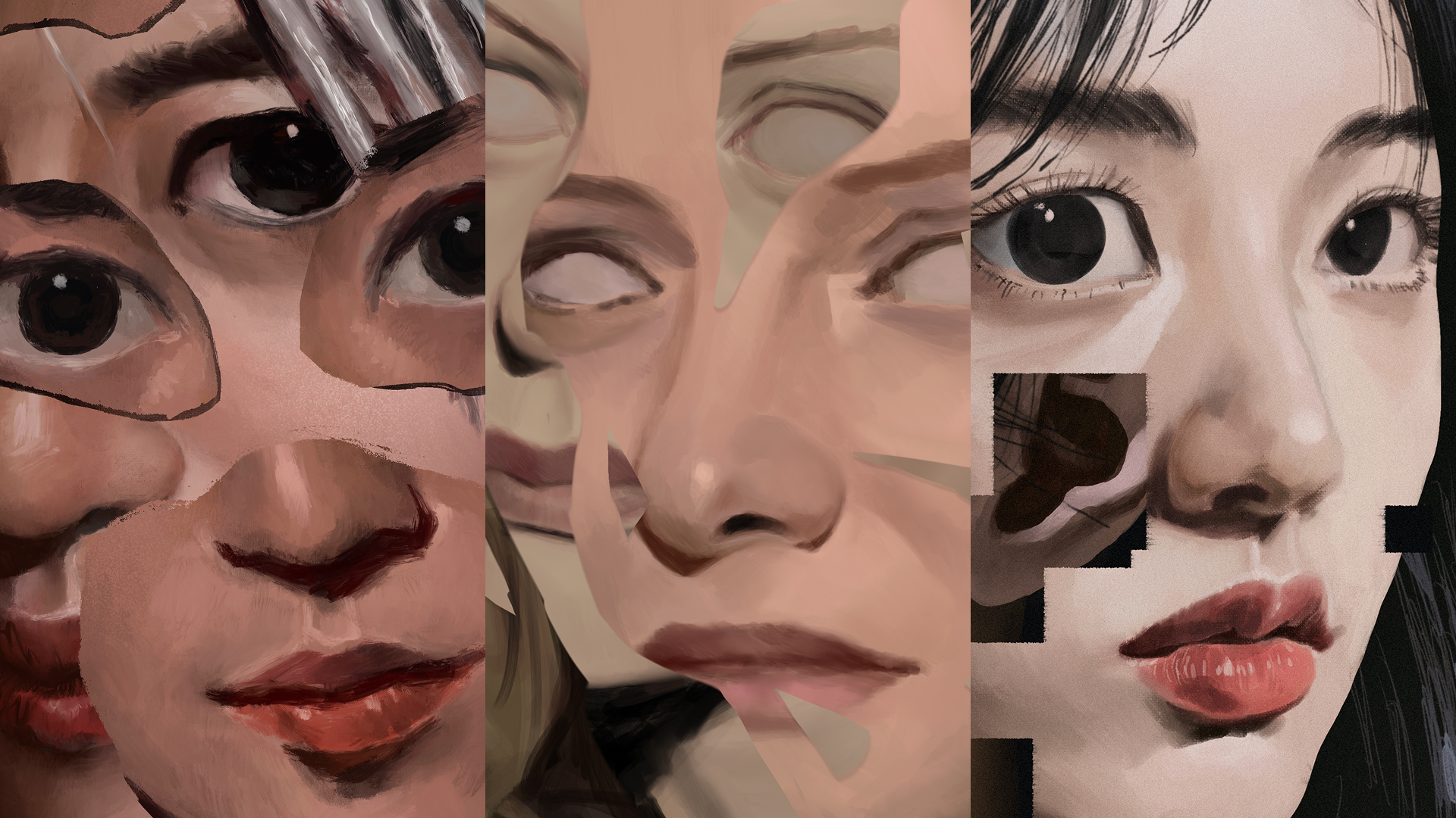
A series of illustrations exploring themes of identity and the "Self".
The series title is inspired by carnival funhouse mirrors, which distort and reshape perception.
---
“自己”とアイデンティティをテーマに展開したイラストシリーズ。
シリーズタイトルは、カーニバルの知覚を歪めるミラーアトラクションから着想を得ています。
1:43AM
The Blueprint
Memory
JPDH
Client:JPDH
scope:Web Design
クライアント: JPDH
担当領域: Webデザイン
Client: JPDH
Scope: Web Design
クライアント: JPDH
担当領域: WEBデザイン
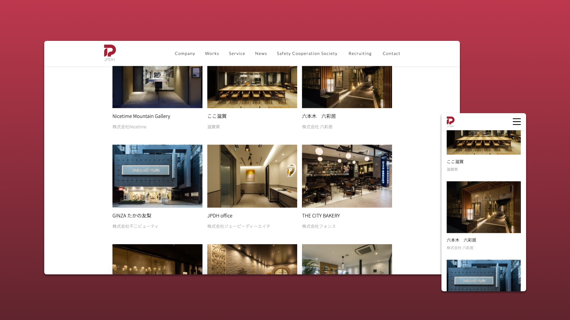
The JPDH Web Revamp focused on modernizing the digital presence of JPDH, a specialized contractor and project manager for commercial spaces in Japan. I led the website design overhaul, addressing a legacy site that had become visually dated, cluttered, and difficult to navigate due to years without updates.
The redesign centered on clarity, structure, and restraint. By introducing a minimalist design system, I re-organized content to improve usability and hierarchy while allowing key information to surface naturally. Ample white space, a refined typographic approach, and a reduced visual language were deliberately used to let JPDH’s project work and photography take center stage, positioning the built results as the primary storytellers of the brand’s expertise.
The resulting site presents JPDH as a contemporary, confident partner in commercial space design and construction. The revamp successfully balanced function and aesthetics, delivering a clean, intuitive experience that elevates the company’s portfolio, improves navigation, and aligns the brand with the standards and expectations of a modern professional audience.
---
商業空間の施工・プロジェクトマネジメントを手がけるJPDHのサイトリニューアルにおいて、デザイン全体を担当。長期間更新されていなかった旧サイトは、視覚的な古さや情報の煩雑さにより、ユーザビリティに課題を抱えていた。
本リニューアルでは、ミニマルなデザインシステムを導入し、情報構造と導線を再設計。余白やタイポグラフィを精査し、施工実績や写真が主役となる構成を実現。結果として、機能性と美観を両立した現代的なWeb体験を構築し、JPDHの専門性と信頼感を的確に伝えるプラットフォームを確立。
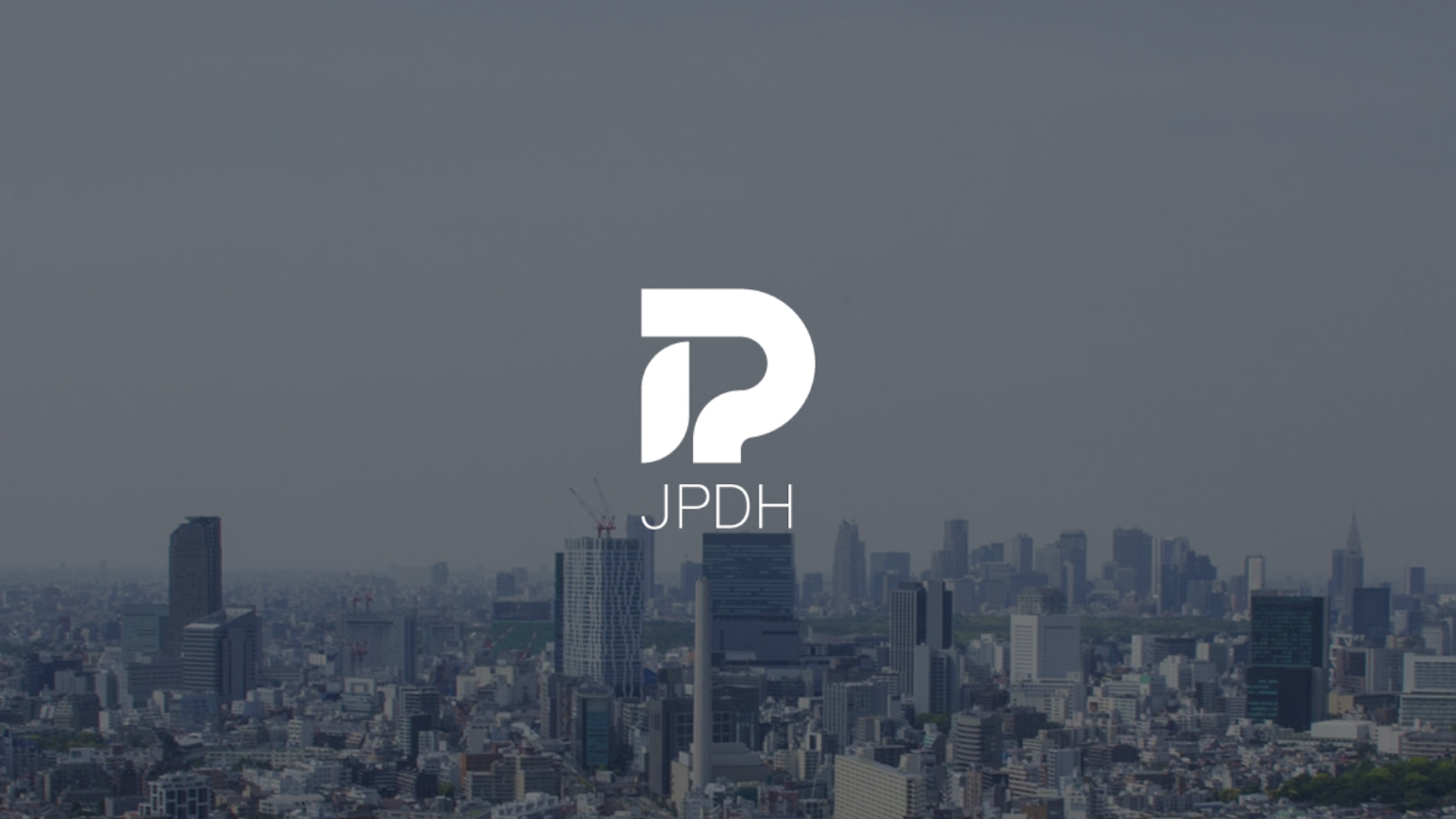
The JPDH Website underwent a major revamp after years of no updates.
---
長年更新されていなかったJPDHのWebサイトを、全面的にリニューアル。
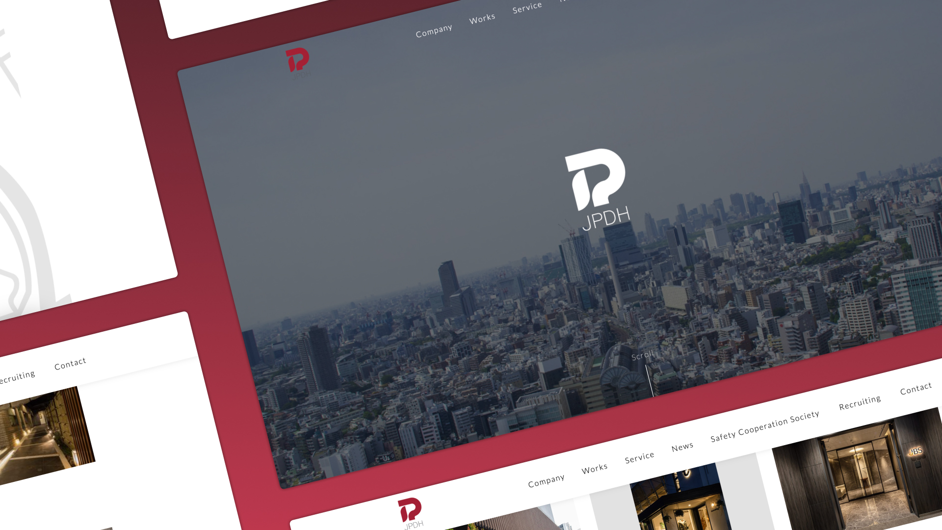
A design system based on clarity and structure highlights JPDH's reliability and quality.
---
無駄を削ぎ落とした洗練されたデザインシステムにより、JPDHの信頼性と品質の高さを視覚的に表現。
The clean and intuitive redesign gives visitors a smooth experience, and allows the portfolio itself to shine.
---
クリーンで直感的な設計により、閲覧体験を向上させるとともに、施工実績が際立つ構成を実現。

Tsumugu Gallery
Client:Yomiuri SHimbun
scope:Image Editing
クライアント: 読売新聞
担当領域: 画像制作
Client: Yomiuri Shimbun
Scope: Image Editing
クライアント: 読売新聞
担当領域: 画像制作
Tsumugu Gallery Is an online exhibition platform developed by Yomiuri Shimbun to present ultra–high-resolution digital reproductions of significant Japanese artworks. I was responsible for the reconstruction and retouching of these works, ensuring museum-level visual fidelity while adapting historically important pieces for a contemporary digital viewing experience.
The artwork scans, provided by Canon, were delivered in multiple segmented files, each several gigabytes in size. To support the technical demands of this process, a custom workstation was built to handle large-scale compositing and precision retouching in Adobe Photoshop. My role involved meticulously reassembling the scans, correcting color and tonal inconsistencies, repairing artifacts, and preserving fine surface details at an extremely high resolution.
This work required sustained focus and rigorous attention to detail due to the scale and complexity of the pieces. The final assets enabled Tsumugu Gallery to present these artworks with exceptional clarity and authenticity, supporting Yomiuri Shimbun’s goal of making culturally significant works accessible to a broader audience while maintaining the integrity and craftsmanship of the originals.
ARTWORKS EDITED:
CHINESE JUNK AND NANBAN SHIPS - KANŌ TAKANOBU
PINE TREES - HASEGAWA TŌHAKU
LION - UNKNOWN ARTIST
WIND GOD AND THUNDER GOD - TAWARAYA SŌTATSU
PAPER BOX AND WRITING BOX WITH FIREFLIES OVER UJI RIVER - IIZUKA TŌYŌ
NINE-FIGURE SET OF AMIDA NYORAI STATUES - VARIOUS ARTISTS
---
読売新聞が運営するオンライン展示プラットフォーム「紡ぐギャラリー」において、超高解像度でスキャンされた日本美術作品の再構築およびレタッチを担当。
美術館レベルの再現性を求められる本プロジェクトでは、歴史的価値を持つ作品の質感や細部を損なうことなく、デジタル鑑賞に最適化された表現を実現。キヤノン株式会社より提供された分割スキャンデータを精緻に合成し、色調補正やノイズ・欠損の修復を実施。大容量データ処理に対応する専用環境を構築し、極めて高い精度で作業を遂行。
結果として、作品本来の魅力と真正性を保ったまま、より多くの人に開かれた鑑賞体験の提供に貢献。
担当作品:
南蛮船図屏風
松林図屏風
唐獅子図
風神雷神図屏風
宇治川蛍蒔絵料紙箱
阿弥陀如来坐像(九体阿弥陀)

Tsumugu Gallery Is an online art exhibition platform developed by YOmiuri Shimbun, presenting museum-quality Images in a contemporary, interactive format.
---
紡ぐギャラリーは、読売新聞社が運営するオンライン美術展示プラットフォームで、美術館品質の作品画像を現代的かつインタラクティブな形式で提供している。

The interactive interface enables visitors to view Historically significant pieces up close in full detail, setting the platform apart from physical galleries.
---
インターフェースは、歴史的価値の高い作品を細部まで拡大して鑑賞できる設計となっており、物理的な展示空間とは異なる体験を可能にしている。

A simplified breakdown of the reconstruction process. artwork would often be provided in more than 20 large parts, each several gigabytes in size and requiring meticulous retouching.
---
再構築プロセスの一例。作品データは20点以上の分割スキャンとして提供され、各パーツは数GBに及ぶため、専用環境を用いた精密なレタッチが求められた。

Select works I was responsible for reconstructing.
Clockwise from top left:
CHINESE JUNK AND NANBAN SHIPS - KANŌ TAKANOBU
PINE TREES - HASEGAWA TŌHAKU
LION - UNKNOWN ARTIST
WIND GOD AND THUNDER GOD - TAWARAYA SŌTATSU
---
担当作品の一部。
左上から時計回り:
南蛮船図屏風
松林図屏風
唐獅子図
風神雷神図屏風
Canon's high fidelity images allows visitors to appreciate Details and textures like never before.
Clockwise from top left:
CHINESE JUNK AND NANBAN SHIPS - KANŌ TAKANOBU
PINE TREES - HASEGAWA TŌHAKU
WIND GOD AND THUNDER GOD - TAWARAYA SŌTATSU
LION - UNKNOWN ARTIST
---
キヤノン株式会社による高精細スキャンデータにより、従来では捉えきれなかった質感や細部まで鑑賞できます。
左上から時計回り:
南蛮船図屏風
松林図屏風
唐獅子図
風神雷神図屏風

EMO+
In-House Product
scope:Concept Design, Graphic Design, Brand Design, UI/UX Design, Image/Video Editing
自社プロダクト
担当領域: コンセプトデザイン、グラフィックデザイン、ブランドデザイン、UI/UXデザイン、画像・動画編集
In-House Product
Scope: Concept Design, Graphic Design, Brand Design, UI/UX Design, Image/Video Editing
自社プロダクト
担当領域: コンセプトデザイン、グラフィックデザイン、ブランドデザイン、UI/UXデザイン、画像・動画編集
EMO+ is an in-house Zoom extension conceived during the COVID-19 pandemic to make online meetings more engaging, expressive, and interactive. As remote communication became the norm, we identified a need to restore emotional presence and spontaneity to digital conversations. EMO+ introduced customizable avatars, live reactions, and an anonymous commenting system to create a more human-centered virtual meeting experience.
I led the project from concept development through brand creation and UX execution. My role included defining the product vision and positioning, developing the brand identity and visual system, designing the UI/UX architecture and user flows, and producing marketing and support materials. I also established the brand guidelines to ensure consistency across the product interface, promotional assets, and support platforms.
Beyond visual design, I focused on aligning the product experience with its core mission: enhancing emotional accessibility in digital communication. Through iterative refinement and cross-functional collaboration, I helped shape EMO+ into a cohesive product that integrates strategy, branding, and interface design into a unified and engaging user experience.
---
EMO+は、コロナ禍におけるリモートワークの拡大を背景に企画・開発した自社プロダクト(Zoom拡張機能)です。オンライン会議が機能的である一方、感情的なつながりや双方向性が不足している点に着目し、アバター機能やリアクション機能、匿名コメント機能を通じて、より親しみやすくインタラクティブな体験を実現しました。
本プロジェクトでは、コンセプト設計からブランド構築、UI/UX設計、ビジュアル制作までを一貫して担当しました。ロゴおよびブランドアイデンティティの開発、デザインガイドライン策定、画面設計・ユーザーフロー設計、サポートサイト制作、プロモーション用画像・動画制作まで幅広く担い、プロダクト全体の世界観を統合しました。
単なるUI制作にとどまらず、「オンラインコミュニケーションをより人間的にする」という思想を体験設計へ落とし込むことを重視しました。戦略・ブランド・インターフェースを横断的に設計した統合型プロダクトデザイン事例です。
EMO+ enhances virtual meetings with controllable avatars, custom themes, and an anonymous commenting system.
---
EMO+は操作可能なアバター、カスタムテーマ、匿名コメント機能を通じて、バーチャルミーティングの体験価値を向上させるプロダクトです。
EMO+ Brand Guidelines.
---
EMO+ブランドガイドライン。

EMO+ Support Page.
---
EMO+サポートページ。
Random_o1
Personal Work
自主制作
Personal Work
自主制作
poster for Former workmates
---
元職場のチームメンバーを描いたポスター
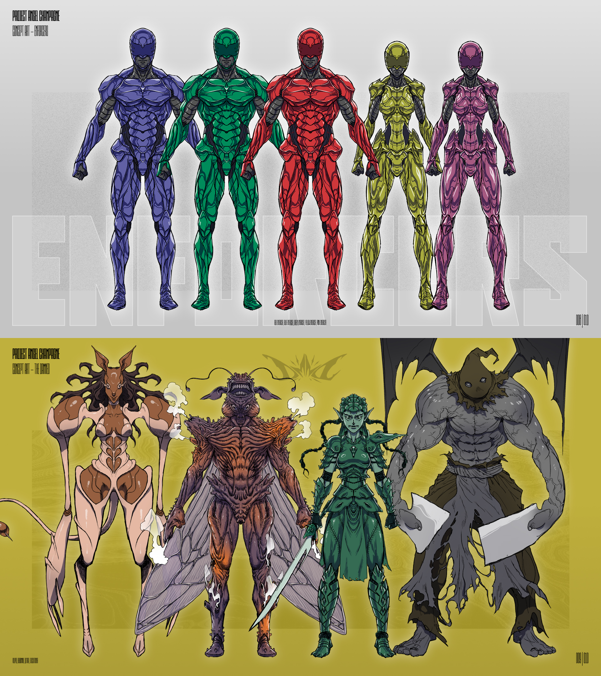
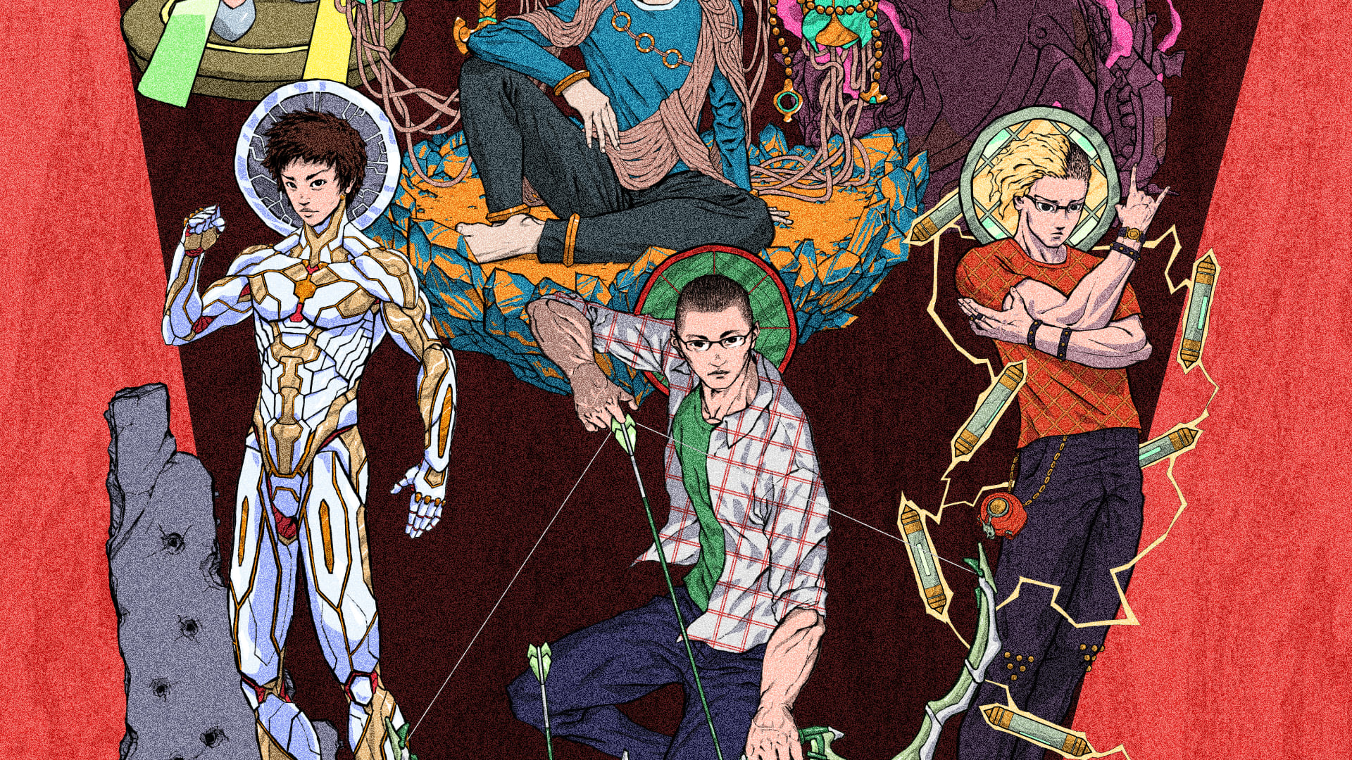
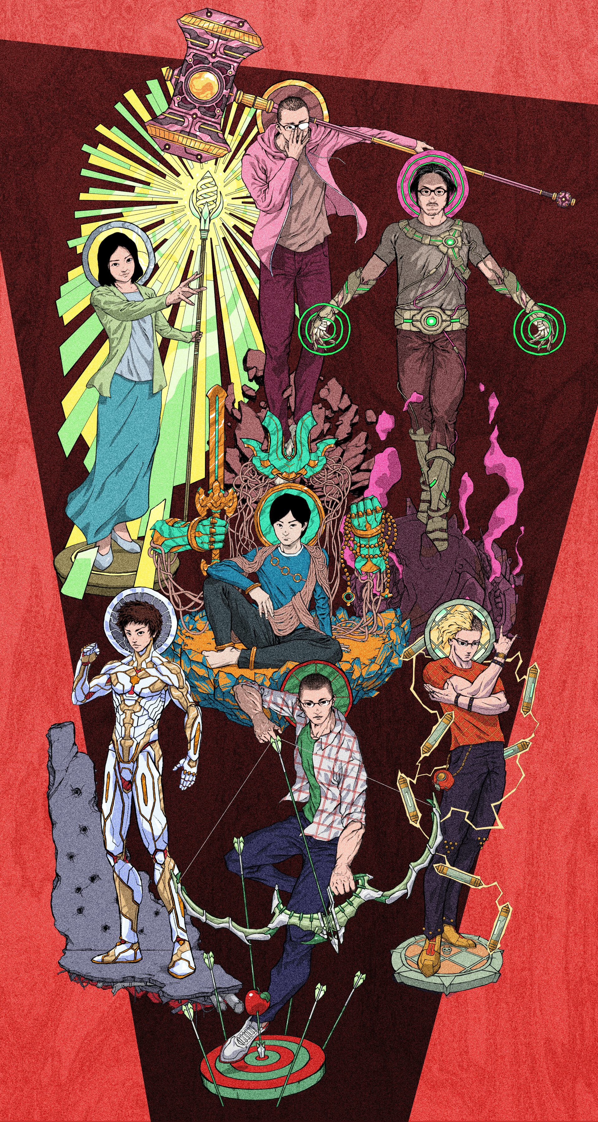
Character concepts for a power-ranger-inspired project
---
戦隊モノにインスパイアされたキャラクターコンセプト
Stride Rite: Fit-TOpia
Client:Vida Shoes International
scope:Graphic Design, Web Design, Image/Video Editing
クライアント: Vida Shoes International
担当領域: グラフィックデザイン、WEBデザイン、画像・動画制作
Client: Vida Shoes International
Scope: Graphic Design, Web Design, Image/Video Editing
クライアント: Vida Shoes International
担当領域: グラフィックデザイン、WEBデザイン、画像・動画制作
Stride Rite: Fit-Topia was a US nationwide experiential campaign designed to introduce the Tropicali footwear collection through a series of family-focused, tropical-themed pop-up events.
My responsibilities included the design of pop-up displays, tour-specific landing pages, and email templates, as well as static and animated social assets used to promote and amplify each event. Working across multiple formats and platforms, I ensured consistency, adaptability, and clarity while collaborating with cross-functional teams to deliver assets at scale and on tight timelines.
The campaign engaged 13,850 attendees, generating 77,000 social engagements, 3.3 million social impressions, and 28.7 million total impressions. The results reflect a strong, integrated creative strategy that successfully translated brand storytelling into both in-person experiences and measurable digital reach.
---
Stride Riteの新作フットウェアコレクション「Tropicali」を訴求する全米体験型キャンペーンツアー「Fit-Topia」において、クリエイティブ制作を担当。
ファミリー層をターゲットとしたトロピカルテーマのポップアップイベントに向け、会場ディスプレイ、ツアー専用ランディングページ、メールテンプレート、ならびに静止画・動画のSNSプロモーション素材を制作。複数媒体・フォーマットを横断しながら、短期間での大量制作に対応し、ブランドトーンの一貫性と高い視認性を担保。
結果として、来場者13,850名、ソーシャルエンゲージメント77,000件、総インプレッション2,870万を記録し、リアルとデジタルを横断した高い訴求力を実現。
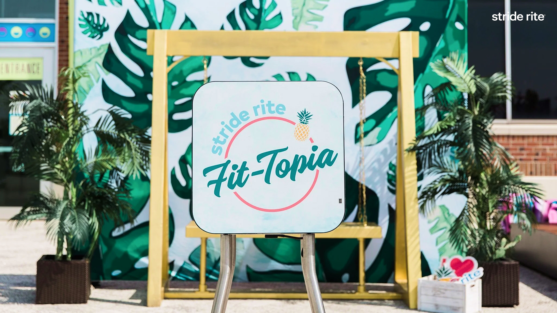
Stride Rite is an American children's footwear company. Fit-Topia was a 10-City Nationwide Tour promoting the tropicali shoe collection.
---
Stride Riteは、アメリカの子ども向けフットウェアブランドであり、「Fit-Topia」は新作 Tropicali コレクションを訴求する全米10都市ポップアップツアーとして展開された。
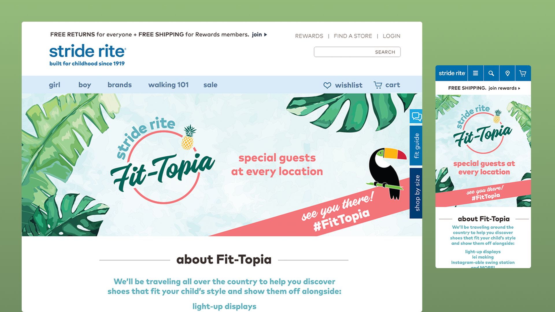
Fit-Topia Event PAges for desktop and mobile.
---
Fit-Topiaツアーに向け、イベント専用ページを制作(デスクトップ、モバイル)。
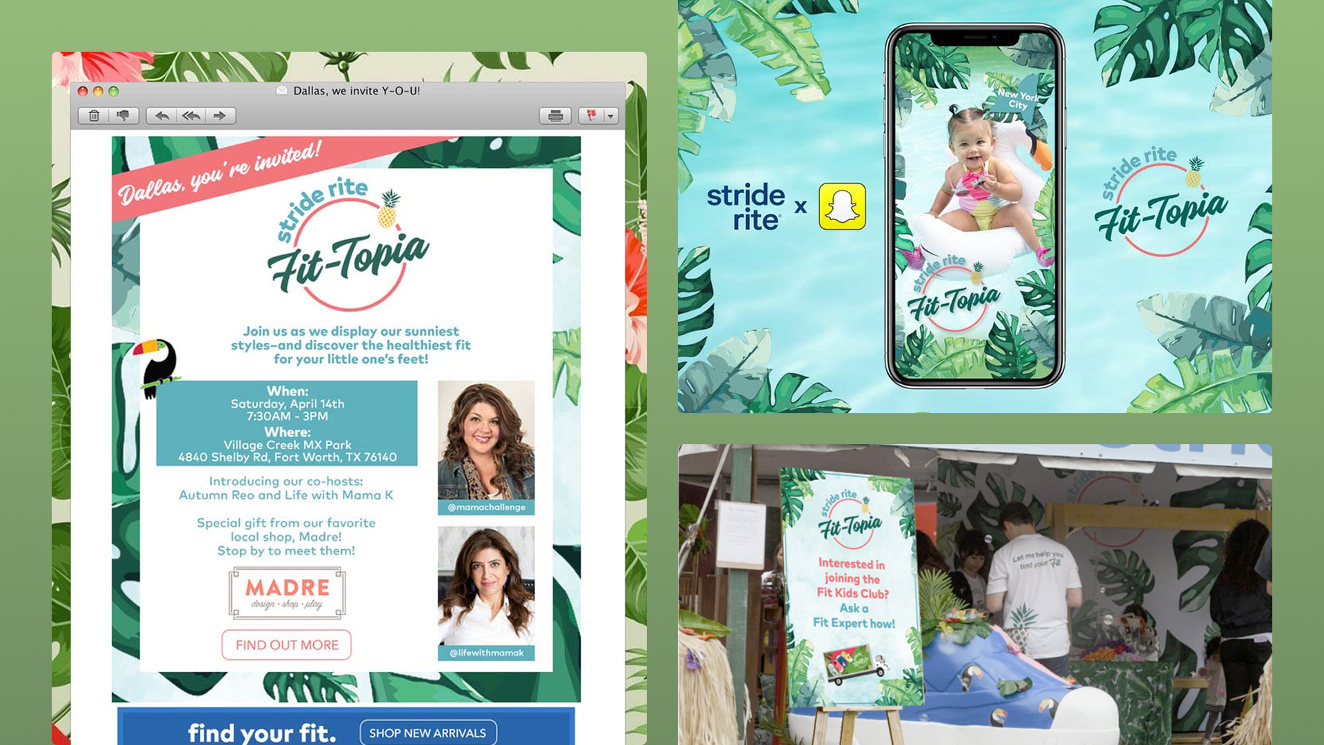
Event Mail templates, Snapchat filters, and physical displays.
---
イベント専用メールテンプレート、Snapchatフィルター、会場内ディスプレイをデザイン。


Dynamic content for social media posts featuring playful explorations of the tropicali shoes.
---
Tropicaliシューズの楽しさや世界観を伝える、動きのあるソーシャルメディア向けコンテンツを制作。
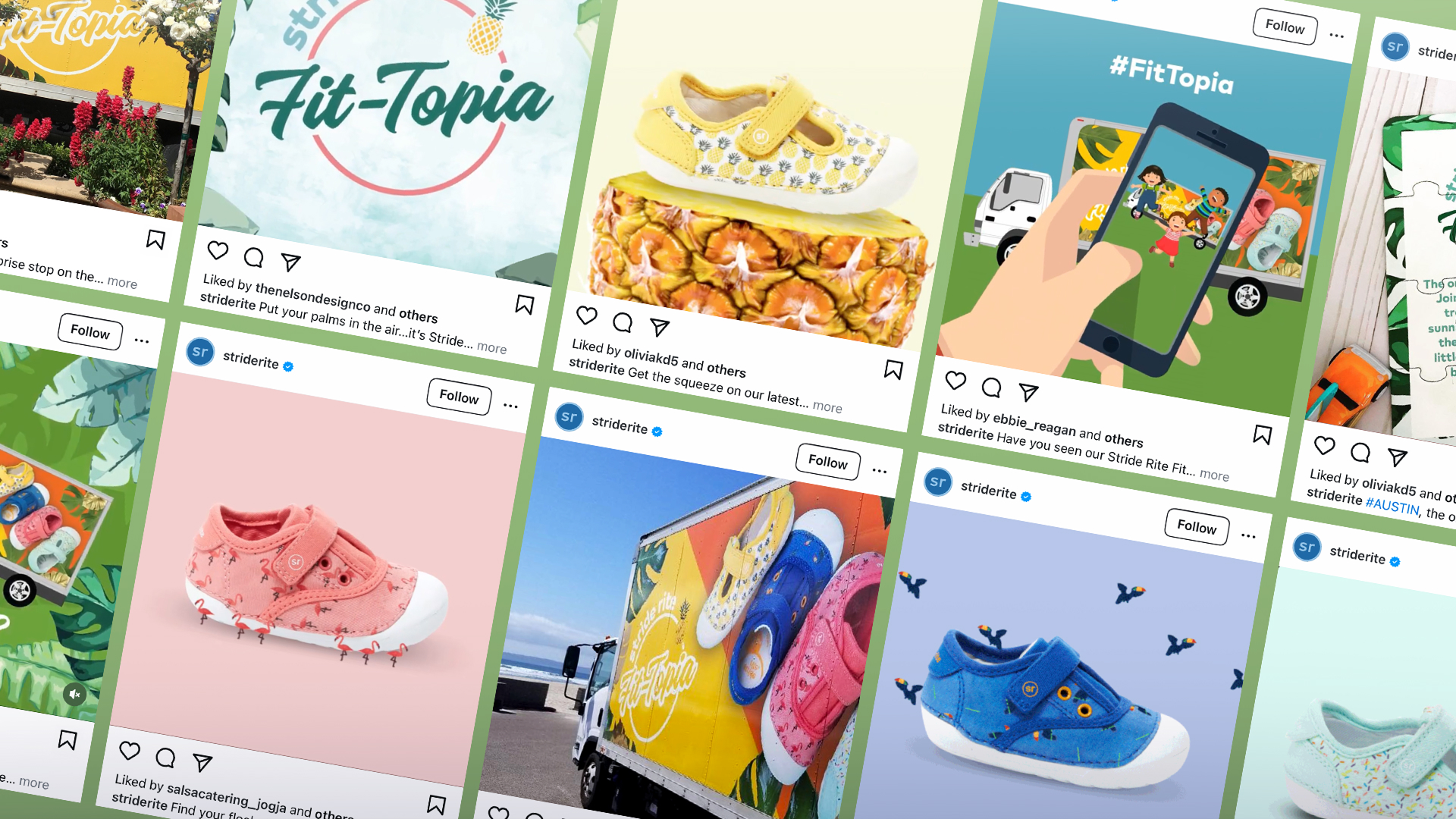
A diverse range of event-specific social media content helped raise engagement and impressions.
---
イベントごとに設計された多様なソーシャルコンテンツにより、エンゲージメントおよびインプレッションの向上に貢献。

Tour truck wrap designs.
---
ツアービジュアルを反映したトラックラップデザインも担当。
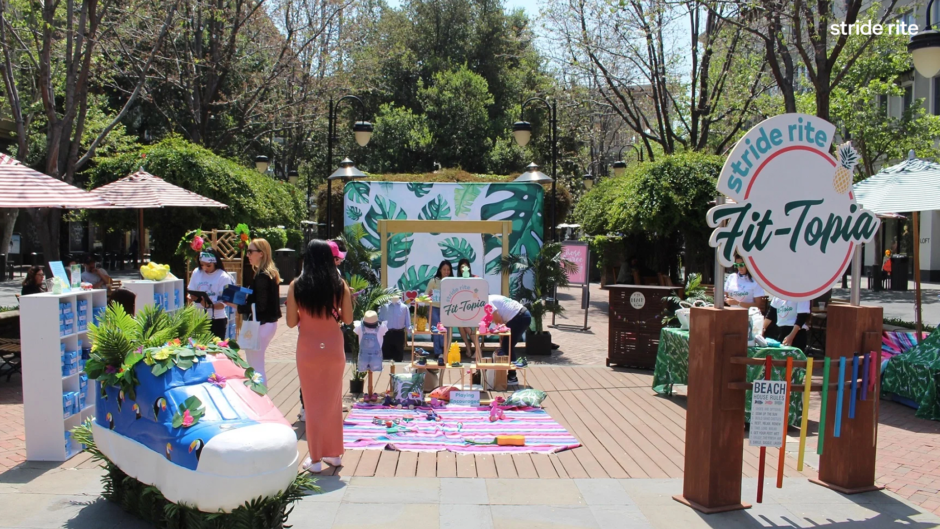
THe Pop-up setup at one of the tour stops.
---
ツアー開催地の一つにおけるポップアップ会場。
TBA
グラフィックデザイナー/ディレクター/アーティスト。10年以上にわたり、数々のデザインプロジェクトをエンドツーエンドで手掛けてきた。国内外問わず、文化的文脈を的確に捉えた表現力と高い完成度のデザインにより、多様なクライアントのブランド価値の成長に貢献。ブラジルで育ち、日本にルーツを持つバックグラウンドを活かし、常にグローバルな視点でクリエイティブに取り組む。
Email: asakiokamura@gmail.com